

Benjamin Moore JUST announced their color of the year for 2020 and it is, surprisingly, a pale and complex pink shade called First Light. It is an appealing name, to be sure, and the color has undertones of gray-blue that keep it from being cloyingly sweet as pastels are wont to do.
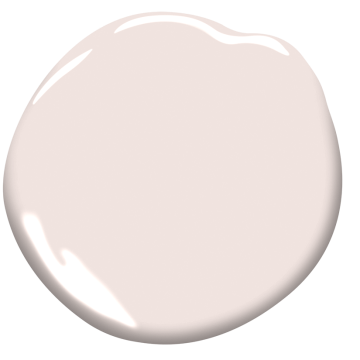
Benjamin Moore First Light 2102-70
In some room photos it looks more of a peachy pink than lavender pink, but lighting will always alter perception of color.
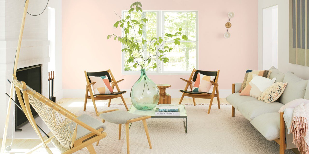
Benjamin Moore COTY 2020 First Light, photo courtesy of Benjamin Moore via AD
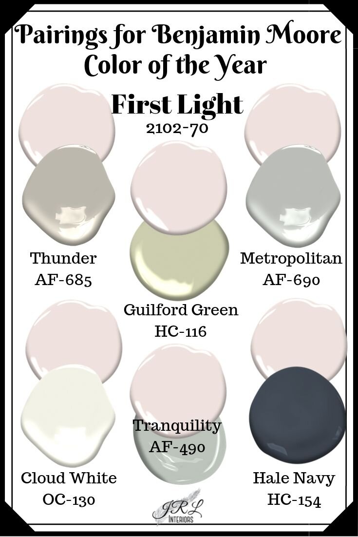
The director of color marketing and development at Benjamin Moore, Andea Magno led the team that researched trend reports and observed the design, art, fashion, environment, and culture from the last months to name the COTY. She and her team were aiming for a “happy and upbeat” color reported the AD article just released. And, as they point out, everyone looks good in a pink room. I’d argue that depends on the shade of pink and the person, but generally, pink does add a healthy glow….after all, an old decorator trick is to line lampshades in pink for flattering light! This color pairs well with almost any other color including the COTY from 2019, Metropolitan Gray. It looks fabulous with Thunder, a mid tone taupe, and many shades of green reminiscent of the garden. It would even be a nice foil to the Sherwin Williams COTY, Naval - a deep royal navy blue!
Sherwin Williams released their Color of the Year with much fanfare nearly 3 weeks ago.

Sherwin Williams Naval, 2020 COTY
Naval is perfect paired with golds or coppers, crisp whites, and nature greens. It references nature (think night sky and constellations), and art deco influences. It’s hardly anything new and earth-shattering - navy is a classic that never really goes OUT of style, but it has enjoyed even more popularity in recent years.

Here, Sherwin Williams Naval is paired with white marble and natural brass accents alongside stainless steel appliances and hardware. The look is both rich and classic. Image via Sherwin WIlliams
So, now that the two big paint companies have announced their picks for Color of the Year, what does it mean? Should you redecorate? Not unless you want to! Largely marketing hype for the paint companies, the color of the year trends are educated guesses at what will be/is popular. Does declaring them to be trends make it so? It’s a chicken and egg dilemma - is it a trending color or a self fulfilling prophecy? And does it matter?
Here’s my take on all that - color is personal, it means different things to different people. It has strong associations for some and is completely ignored by others. Light and environment affects our perception of it. There are no bad colors, really, just bad applications of it. All colors have a place in the universe - it’s just not always on your walls! But announcing a color of the year might make you consider something you hadn’t thought of, or look at a color in a new way or paired in new combinations, and that’s never a bad thing! Maybe we are culturally ready to get past our bias of “pink is for girls” and embrace it as the color of the First Light of the morning sky instead! I think it would make a FABULOUS ceiling color - sort of your own personal dawn! What do you think? Would you paint a ceiling this color? Or a room? Let me know in the comments below!

And here is a comparison of the paint color of the year from four different companies! Fascinating how they all arrived at such different choices!

Need help selecting YOUR perfect paint colors? We offer virtual paint consultations! Click HERE to learn more.
