

Color is trending, finally! And thank goodness - not a moment too soon! We were all about to drown in a sea of despair from the interminable gray and white and minimalist farmhouse aesthetic of {too many} recent years!
I’ve been watching color creeping into the trade shows and markets for the last few years.
It started with a variety of greens and teals and warmer neutrals, and then the advent of more coral and golden hues in furnishings.
And it finally exploded at the recent kitchen and bath show where NOTHING was gray and white and colors of all sorts were in evidence for everything from appliances and cabinetry to plumbing fixtures. Read all about the latest trends from the kitchen and bath show here.
We just received a new box of fabric books with the latest offerings and there are some beautiful options including a LOT of my favorite - embroidered patterns and textures!
These books are indicative of the general color trends in interiors and the return to pretty, classic, and personal - yippee! I’ve never gotten off that train, personally, but it’s nice to see more options in the general population!
We’ve put together some fun combinations and paired them with paint colors from Benjamin Moore to inspire you to create one-of-a-kind looks for your own home.
Here are some of the categories we are seeing:
Coral and Blush
These warmer hues are at once comforting and glowing - these colors from earthy clays to floral shades and beautiful sunsets. Notably, Pantone selected a pale coral shade for it’s color of the year 2024.

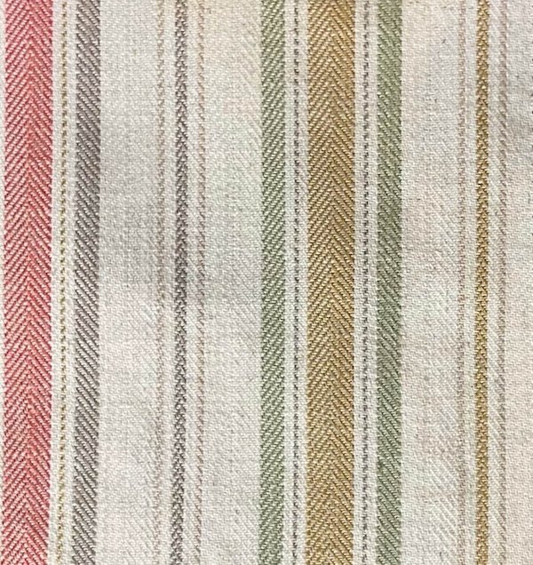
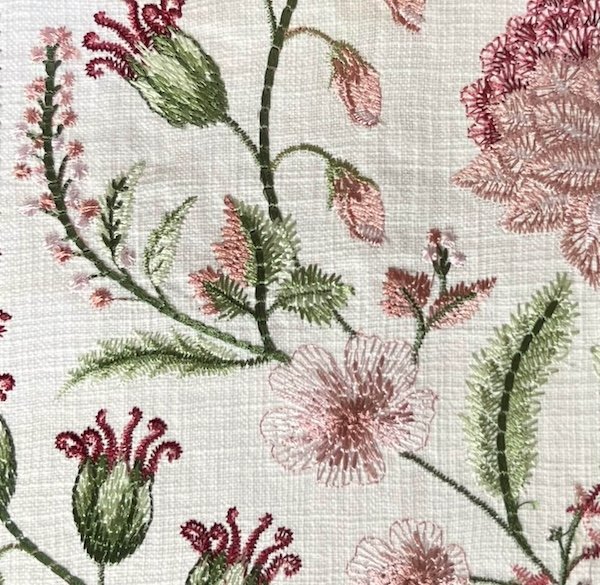
And of course corals and pinks are a natural with green! This versatile stripe pulls some gold into the mix, and the stunning embroidered botanical is an elegant option for a pink and green palette.
Greens
Natures neutral - I always call this the Miss Congeniality of colors as it goes with virtually every other color and differing shades of green even play nicely together…just like in nature!
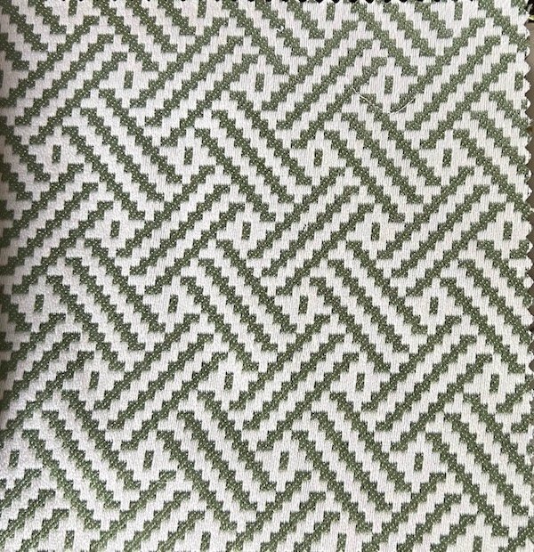
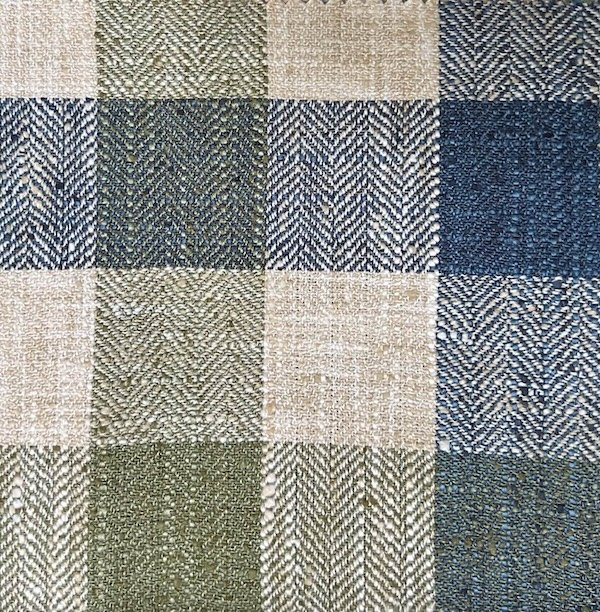
Greens are available in every type of fabric, from fanciful prints, to embroideries, to geometrics like this textured stipe or the classic green houndstooth check.

It is a super popular color trend for kitchen cabinets in every shade from celery or sage to deep forest green. And greens mix so perfectly with natural wood tones, of course!
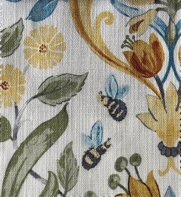
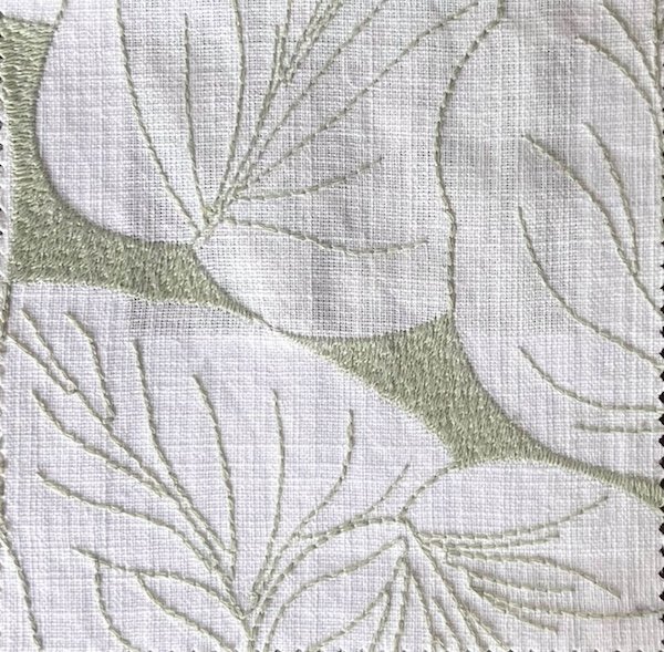
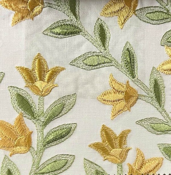
Green paired with yellow is so quintessentially spring! Here are a few additional fabrics from the new collection; a sophisticated printed floral with the whimsy of bumblebees, a textured basketweave effect for pillows or upholstery, a muted large scale embroidered leaf pattern for a more modern take, and a rich embroidered yellow floral.
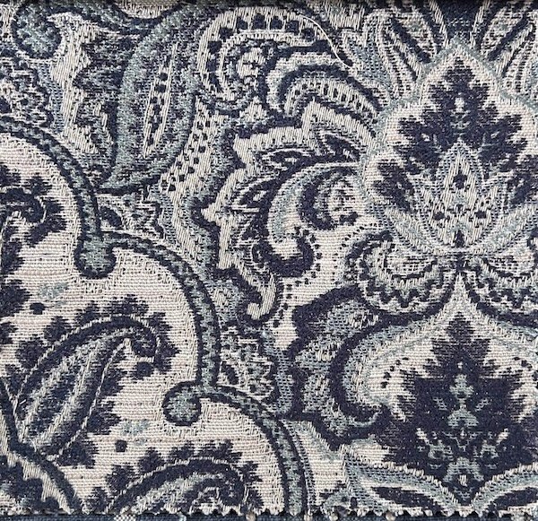
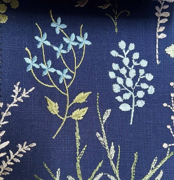
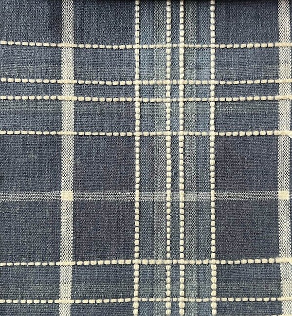
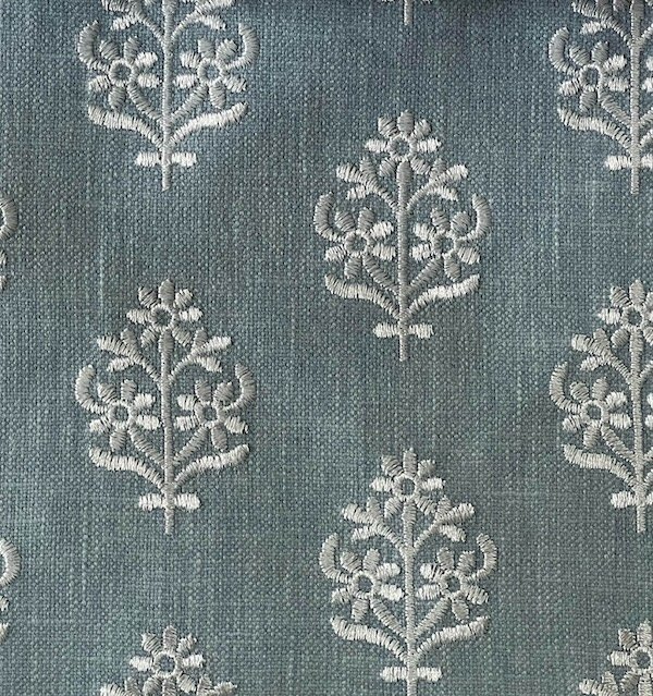
Blues
Another color found in abundance in nature from sky to water, blue is an enduring classic.
Blue shades are also a trending kitchen cabinet color in every shade from sweet pastel to royal navy.
Both Benjamin Moore and Sherwin Williams chose shades of blue as the color of the year for 2024.
Shades of blue range from gray blues and periwinkle to greener blues that approach aqua, and everything in between!

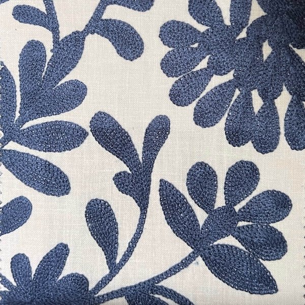
Here are some more blue fabrics from textured wovens to tapestry, to embroidered linens!

Warm Neutrals
The shift to warmer neutrals has been on for a while. Someone needs to tell that to the stagers, house flippers, and spec builders that haven’t gotten the memo and are still painting everything gray with abandon whether it looks good in the rooms or not. 🙄
Anyway, starting with the ever popular Revere Pewter and Edgecomb Gray {Benjamin Moore} taupe paint colors, we’ve been moving ever warmer. Creamy softer whites are a nice foil to blues and greens and less jarring with corals than the starker whites might be. There is still a place for cooler neutrals, to be sure, it just isn’t the default anymore.
These textured fabrics feature appliqué, embroidery, eyelash fringe, and a playful soutache floral design.

Bold Colors
Perhaps it is a response to all the insipidly plain vanilla decor of recent years, but bright and/or dramatic seems to be a more common alternative.
Sometimes that just means high contrast like an elegant black paired with white (which I employed in my own kitchen makeover recently).
And sometimes it shows up as garden brights and tropical shades.

Of course there are a myriad of colorful fabrics from sophisticated botanical embroideries to this whimsical watercolor polka dot print. Wouldn’t this be a fun addition to a children’s space?

Regardless of what is trending…or not…there is definitely a staggering variety of options; something for every style and taste. It has never been easier to find ways to express your own unique personality in your home!
