
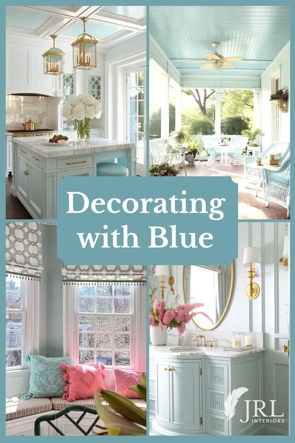
The color Blue can evoke so many moods and images from calm sea glass and spa colors to inky night sky shades and all the water and sky colors in between, and decorating with blue can be tricky!
A paint that looked like a perfectly innocent sweet blue on the 1” chip in the store can transform into a crayola crayon nightmare when multiplied out on your walls.
Blue has been enjoying a surge in popularity again which is good news for blue lovers everywhere!
Personally, I think you should use whatever colors make you happy and look great in your home and not worry about what is or isn’t popular, but colors do seem to go in and out of fashion – just look at all the attention we give to the various “color of the year” announcements each fall like it’s the academy awards for colors, when it is really just a marketing strategy.
The fashion and home furnishings industries produce and market certain collections and the media beats it to death until we think we MUST have those particular colors or we’ll be hopelessly out of style!
Sure, there are plenty of things that are hopelessly out of style, but the colors themselves are not to blame….I mean call harvest gold “dijon” and pair it with some teal or cobalt or charcoal and it can look downright chic! Just don’t make bathroom fixtures and appliances out of it ever again. Please.
Many, many years ago I was working on my first showhouse room and 98% of the rooms in the showhouse were some variation on yellow. Then came a phase of jewel tones with lots of hunter green or cranberry or eggplant or cobalt rooms…and then we were all drowning in a sea of grey and griege for {what seemed like} about a million years.
There is nothing wrong with any of those colors and there are successful timeless designs using each of them. But today, let’s explore the possibilities with shades of blue.
What if I don’t want to commit to a whole room painted blue?
Here are some OTHER classic ways to incorporate shades of blue in a room. And then at the end of the post are 10 gorgeous shades of blue paint.
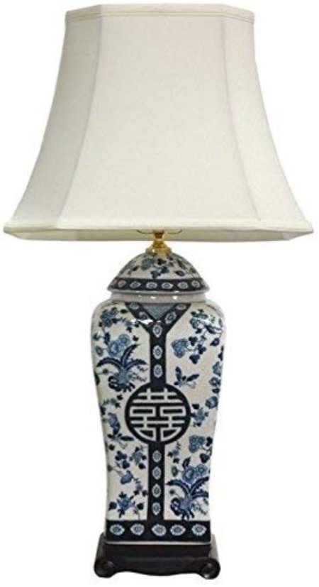
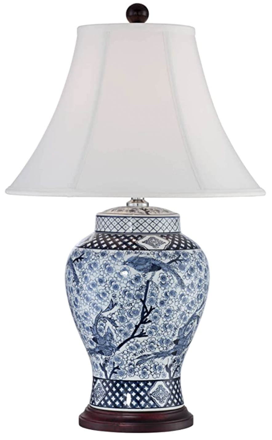
Blue and White Porcelains
Blue and white ginger jars, lamps, garden stools, plates - all of these look great against SO many other colors….yellows, reds, greens, neutrals…
Blue and white lamps, and especially Chinoiserie patterned ones, work in almost ANY room, adding sophistication and richness.
Blue and white garden stools can function as extra seating tucked under a console table when not in use, or as pretty and practical little side tables to perch a drink or book on next to a chair or sofa.
A collection of plates makes a nice addition to art on a wall, and ginger jars, vases and cache pots make a striking sculptural collection on a mantel or tabletop even in their naked state without floral arrangements or plants.
This is a blue and white plate collection we arranged for a client as part of the wall art. Some are antiques and some are new inexpensive finds, but they all work together to add interest to the wall and highlight the blue in the painting.

JRL Interiors
Fabrics, Wall Coverings, and Rugs
Textiles in crisp blue and white patterns such as toiles, florals, stripes, and geometrics, and rich textures like velvet, chenille, and matelasse all contribute a fresh classic feel to a room.
This soaring great room is grounded with an organic patterned contemporary area rug in shades of blue and taupe. Gorgeous embroiled fabrics and cut velvets add texture and depth to custom upholstery, pillows and curtains. You can see more of that great room project HERE.

Quail Ridge Project Great Room, JRL Interiors
Here, whimsical wall covering in royal blue with white is paired with striking blue picket tiles in the shower. The deep colors are balanced with white millwork and Carrara marble for a fun and fanciful guest bath (more HERE).

Fanciful Guest Bath, JRL Interiors
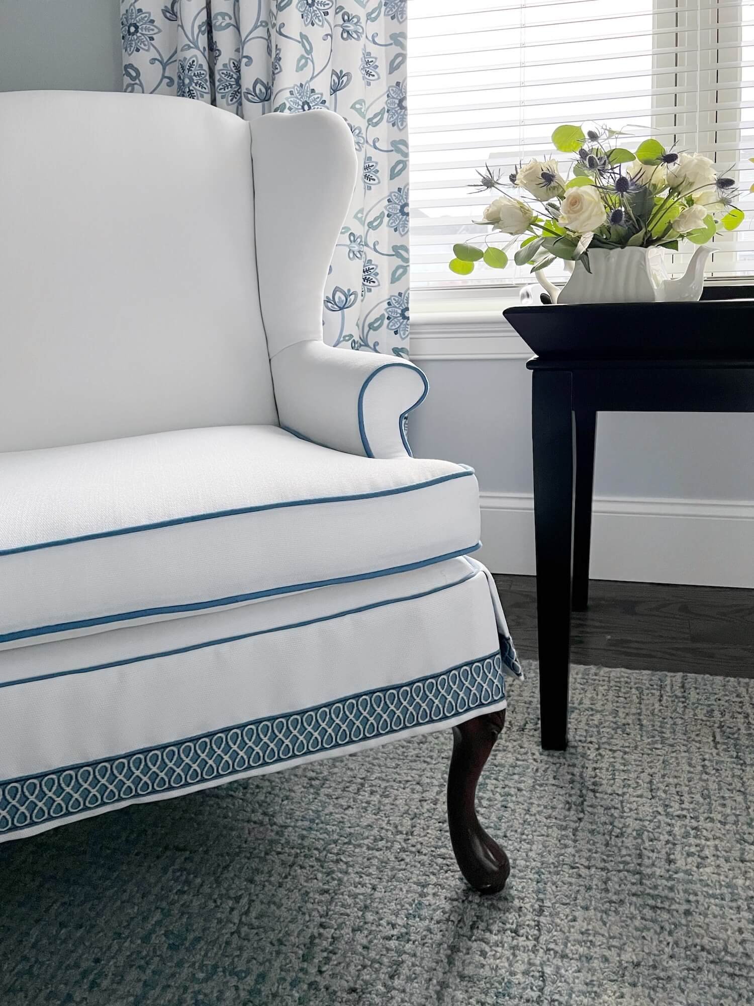
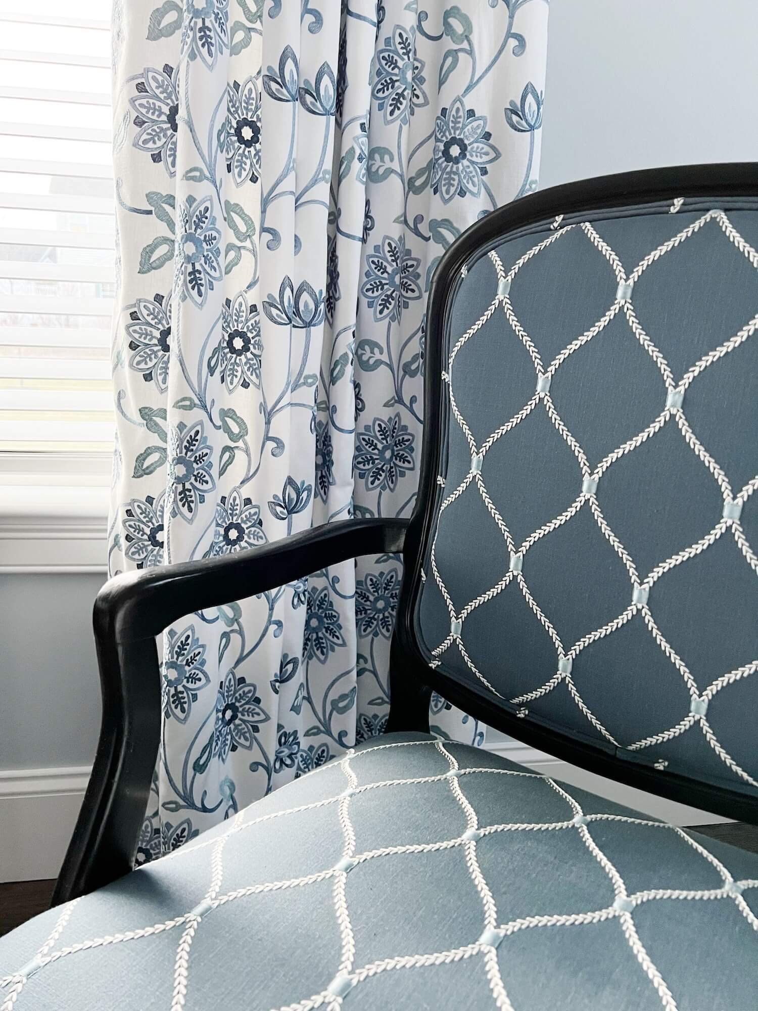
Blue can be calming too so it is a perfect choice for sleeping spaces. Navy velvet mixes with blue embroidered florals, a blue tweed rug and crisp white matelasse bedding in this serene bedroom. More from this new build project HERE.

A serene blue and white bedroom, JRL Interiors
The sitting area in that same bedroom sports a wing chair with blue trim and piping and a side chair covered in a blue embroidered lattice pattern.
Painted Furniture or Cabinetry
Blue furniture can create many different moods - lacquered gloss pieces in rich blues inject excitement into neutral rooms, and softer chalk painted blue pieces contribute to a more casual rustic feel. Blues always pair equally well with whites and neutrals and a variety of wood stain colors.
Built-in cabinetry or paneling painted in a rich deep blue gloss finish adds drama and warmth. And light blue finishes can add charm
Below, a gorgeous blue stained credenza is a standout piece that doubles as a console for the sofa in this great room project.

Light blue cabinetry adds a soft, feminine touch to this imagined bathroom and kitchen.

JRL pale blue bath AI image via midjourney

JRL robins egg blue kitchen AI image via midjourney
Navy island cabinetry is a crisp accent in this open white kitchen repeating the blue color palette used throughout the house.

New build great room kitchen, JRL Interiors
Please note: this post contains affiliate links meaning I may make a small commission on any purchases at no additional cost to you.
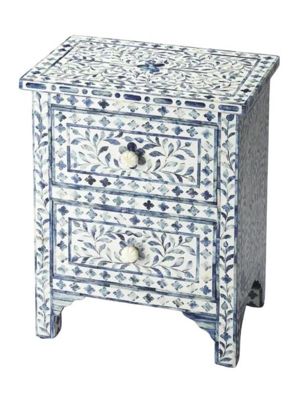
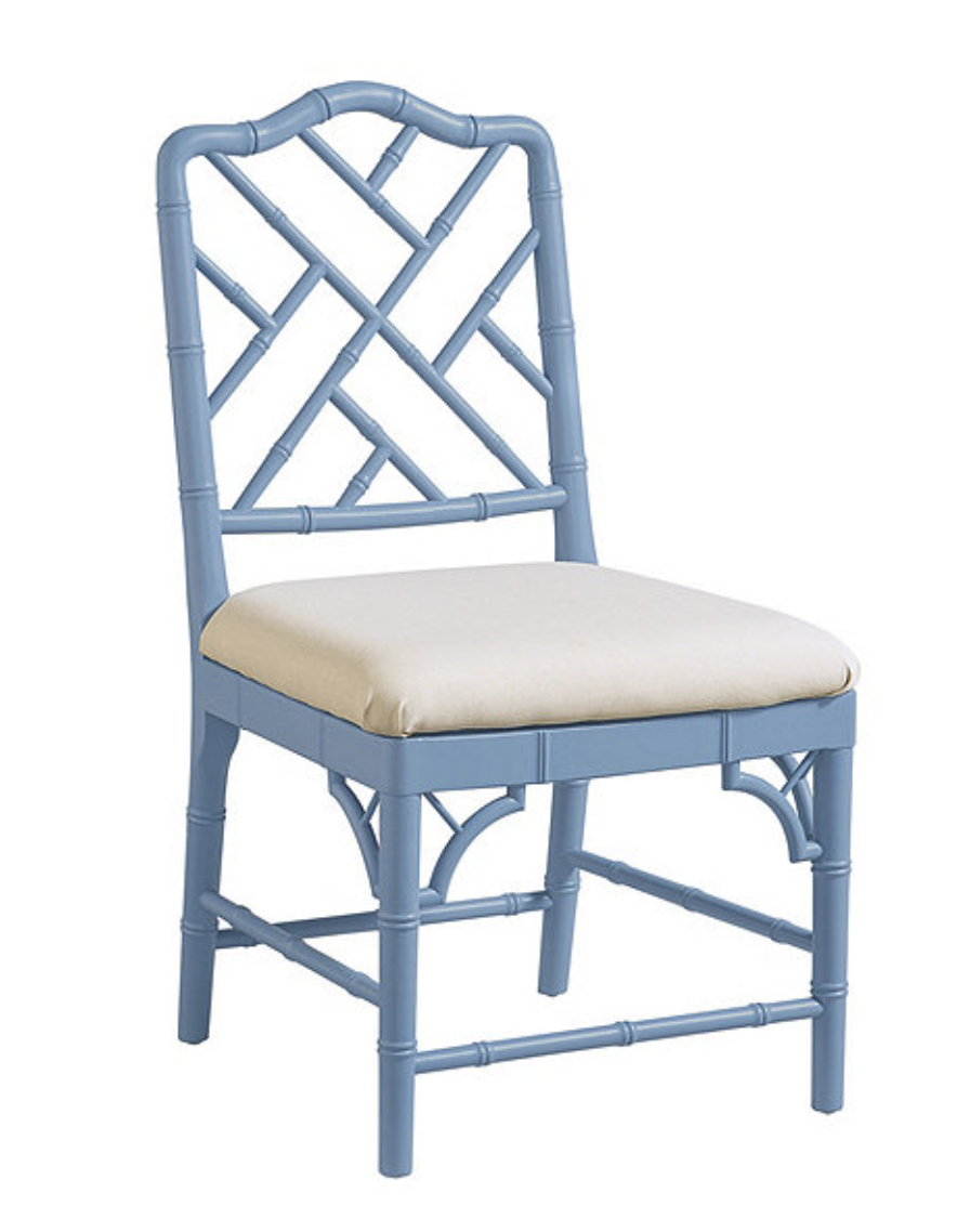
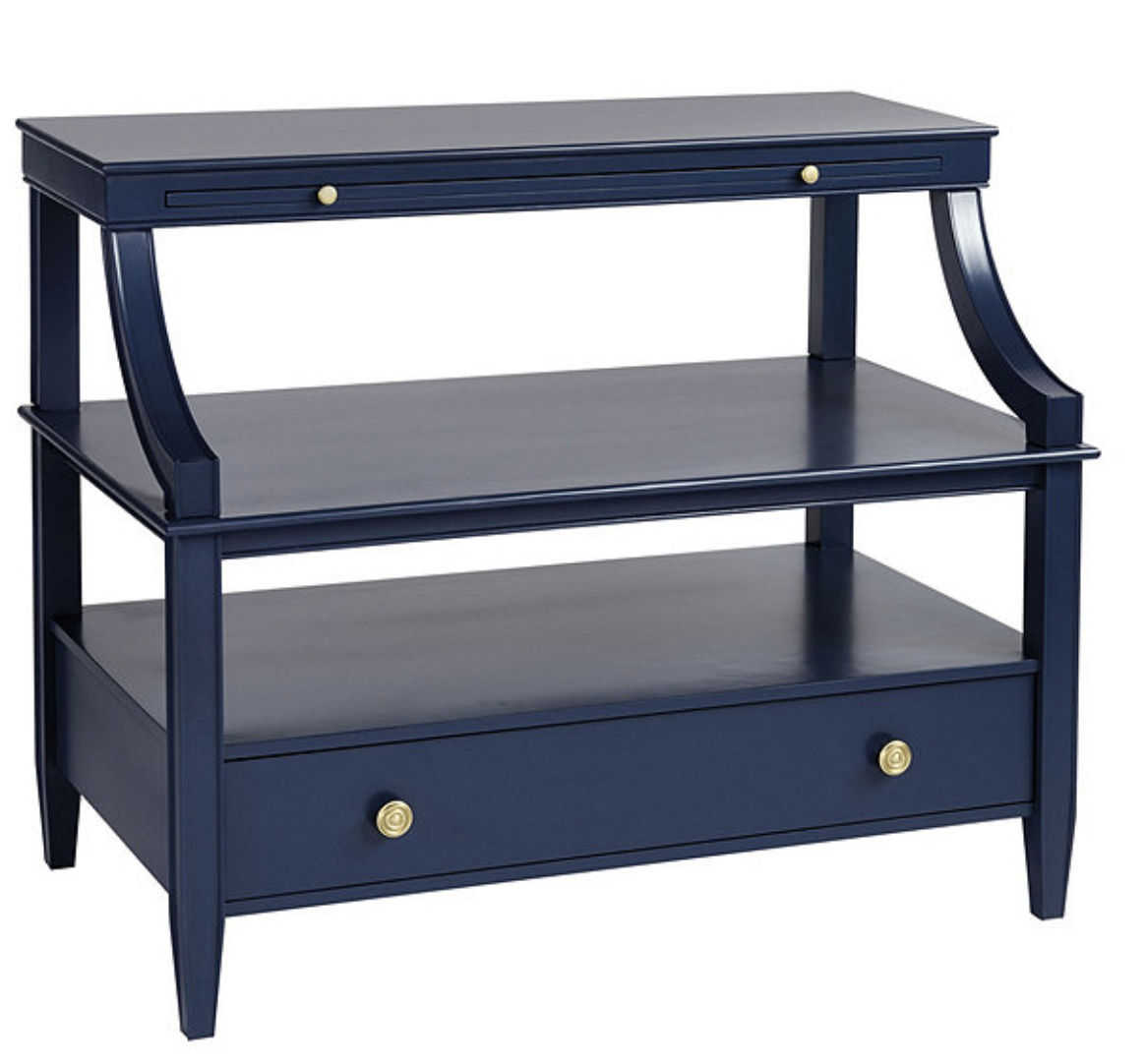
Shop the Look for blue accent pieces; click on each image for more information

Painted Walls
There are many wonderful shades of blue from pale gray blues to rich deep teal blues.
A few of my favorite Benjamin Moore deep toned blues are Van Deusen Blue, Mozart Blue, and Hale Navy These look dramatic and are especially nice paired with white and wood tones.
These are fabulous for powder rooms, dining rooms, libraries, and bedrooms. If your walls are in stellar condition, consider using a gloss finish for your dark colors to reflect some light. Just be warned – gloss shows up every bump and imperfection!
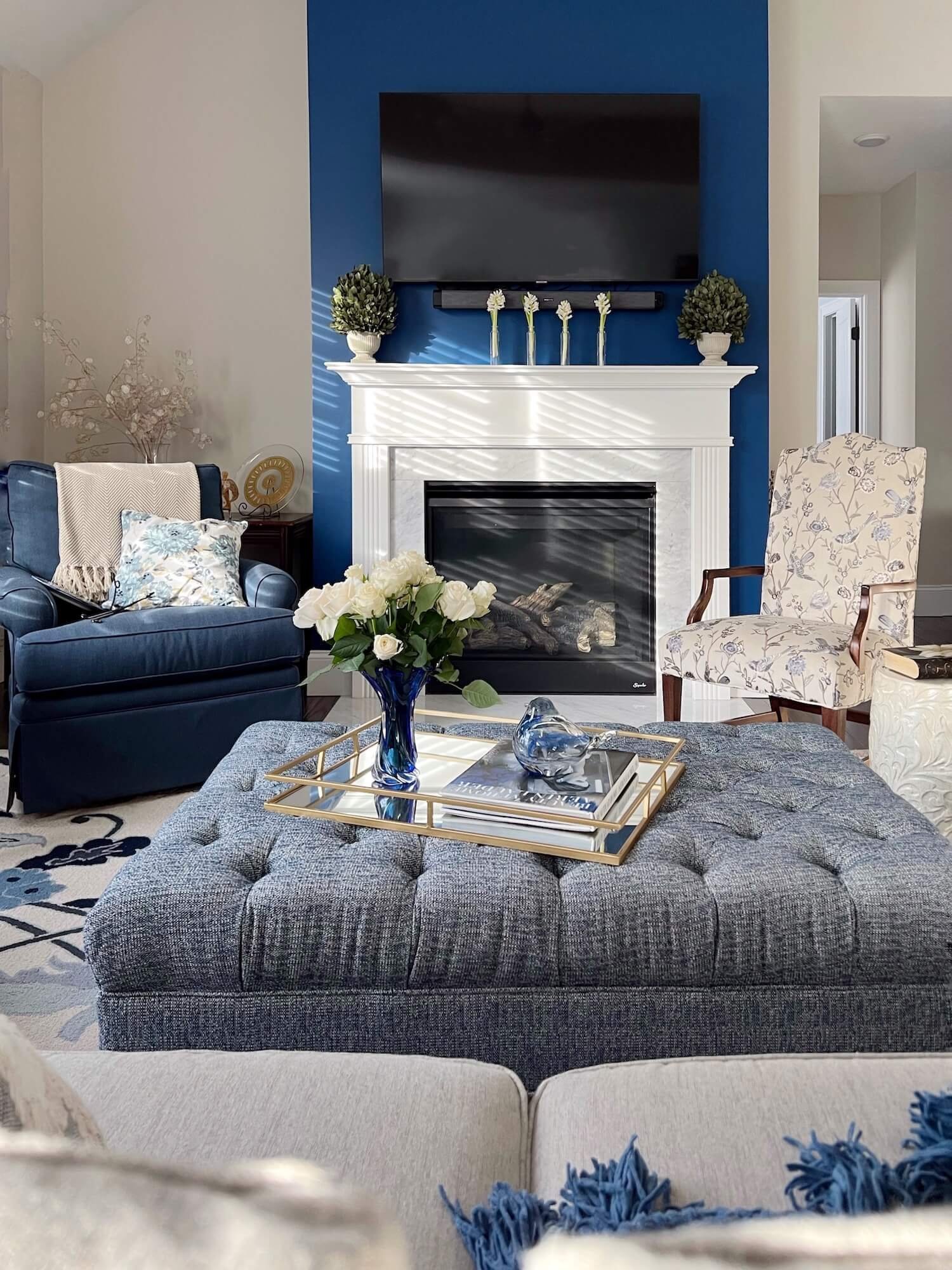
We used a dark blue paint to accent the chimney breast in this cathedral ceilinged great room. As an added bonus, the darker color helps camouflage the television.
Mid tone complex Benjamin Moore blues like Palladian Blue and Constellation are wonderful for bedrooms and living spaces as they change with the shifting light throughout the day.
This sunny and playful breakfast room got a gorgeous makeover that included Benjamin Moore Palladian blue walls and crisp white dove trim.

And for when you just want a hint of blue not some cloying baby blue that screams “taste-free plastic childrens toy”, Whispering spring, Opal Essence, Quiet Moments, Ice Cap, and Silver Mist are all pale greyed blue or blue greens from Benjamin Moore that fit the bill.
Painted Ceilings
Don’t forget the “5th wall” in your rooms! That would be the ceiling, if you haven’t heard that before. Unless you have one of those textured ceilings in a sand or popcorn finish (in which case you want to avoid calling ANY attention to it!), consider painting your ceiling a contrasting color.
This is especially lovely if you have white walls or trim and blue is an especially nice color for ceilings since it is reminiscent of sky.
In this garden inspired library (more HERE), we painted the coffered ceiling panels in Palladian blue giving the air of a pergola overhead with the sky peeking through.

Garden inspired library with sky blue ceiling, JRL Interiors
Southern architecture almost always puts an aqua blue on porch ceilings…originally folklore said the blue would ward off evil spirits because they couldn’t cross water and it became known generically as Haint Blue. Haint means ‘haunt’ and apparently evil spirits are not very smart if they think blue paint is the same thing as water?!
If that was the goal perhaps a moat would be more effective, just sayin’…Other explanations for the practice of painting porch ceilings blue said that bugs and birds wouldn’t build nests near a blue ceiling (perhaps because they think it is open sky?...
I don’t pretend to know the inner workings of bug or bird brains…) In any case a porch ceiling, or any ceiling for that matter, looks great in any number of variations on a sky color.
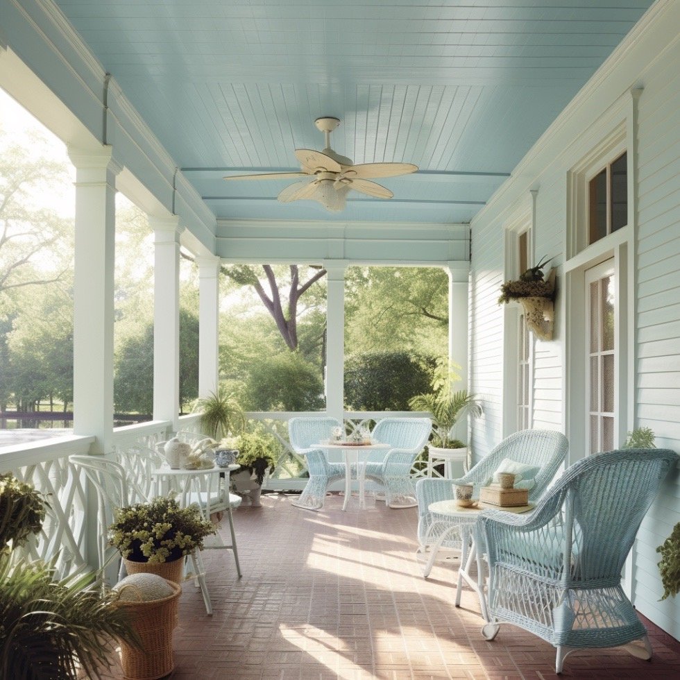
AI #midjourney image of front porch with haint blue ceiling
Choosing Paint Colors
Always, always, always choose your paint colors in the space where they are going. Paint colors look very different in different circumstances. You cannot expect a paint color you love in a picture or at a friends house or at the store to look the same in YOUR house. This post has some practical guidelines for choosing your perfect paint color.
And finally, here is a chart of 10 of the best Benjamin Moore shades of blue paint. This list includes something for everyone from subtle pale tones to deep bold hues. Please pin the chart for reference!
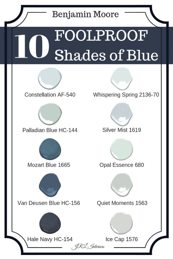
The 10 Best Shades of Blue Paint