

Winter whites aren’t the only winter colors, though looking outside around here right now you might question that.
Since this is the 526th day of January, it seems a good idea to embrace the unique light and nature colors of the season and celebrate them.
Here are 7 color palettes inspired by the season
I specify Benjamin Moore and Sherwin Williams paint most often. All colors referenced are from Benjamin Moore.
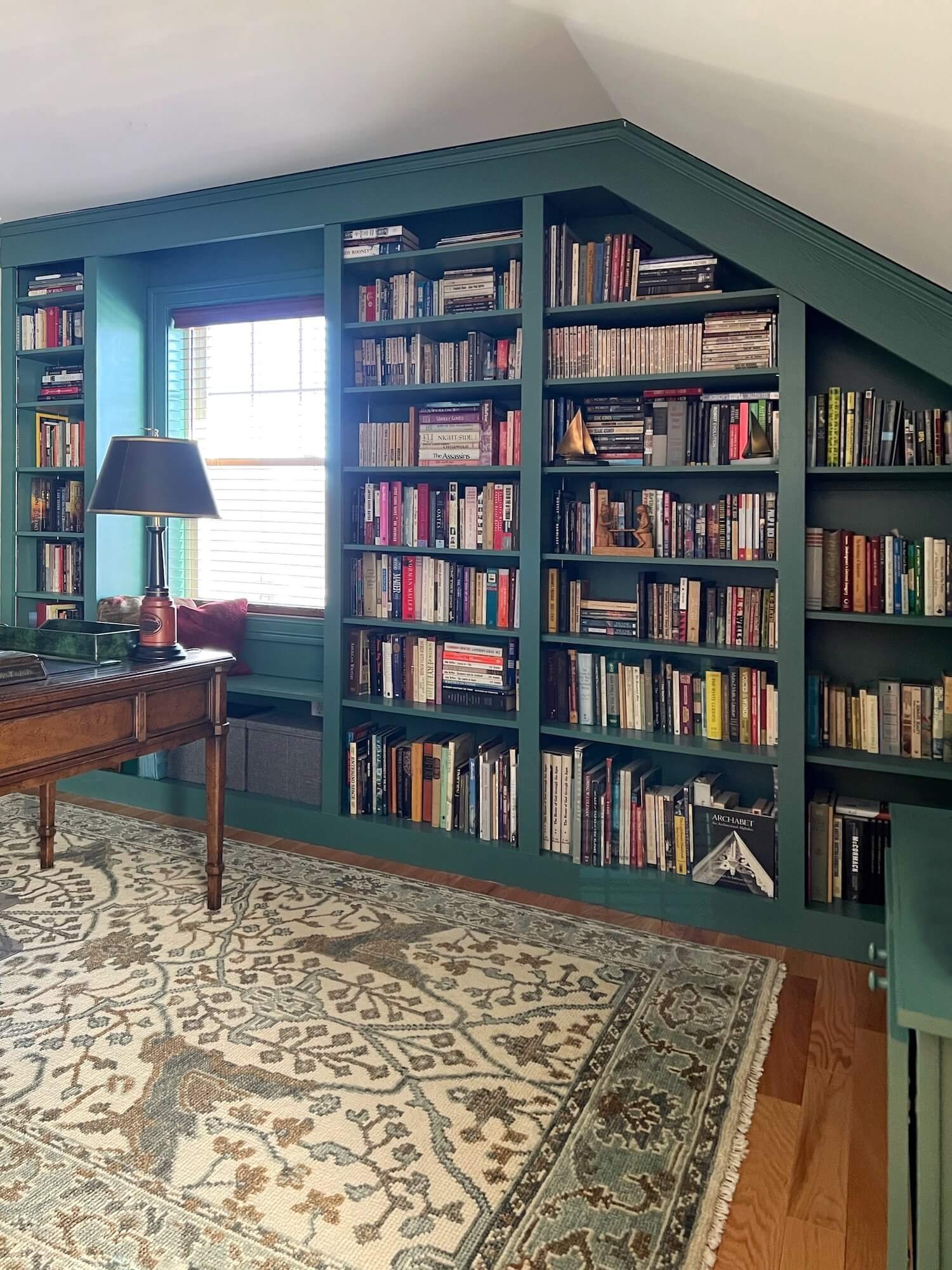
Winter Berry Colors
Red and green are not just for Christmas anymore. As complementary colors they are high contrast and add a bit of dramatic flair to any room.
Try deep green cabinets with a touch of red in the decorative accessories, or a cozy green living room with the dramatic punch of throw pillows in a pattern containing red.
Or red library shelves with green in the accents…anything from plants to pillows!

custom built-ins painted red in this mezzanine library, JRL Interiors

Cocoa Inspired Colors
Winter is also hot chocolate season! And nothing is cozier than a rich chocolate brown room. Warmer colors are trending and they are especially appealing in the cold winter months.
The transformation painting this home office in chocolate brown was remarkable - you can see the before pictures when it was just white here.


Pair chocolate with touches of blue and marshmallow white for classic elegance and timeless appeal.

Winter Green Colors
Snow frosted evergreens and pinecones are the quintessential elements of winter. Use a variety of shades of green and add warm browns for a fresh, earthy mood.
green library under the eaves, JRL interiors
A dash of contrasting snow white highlights and sharpens the colors.
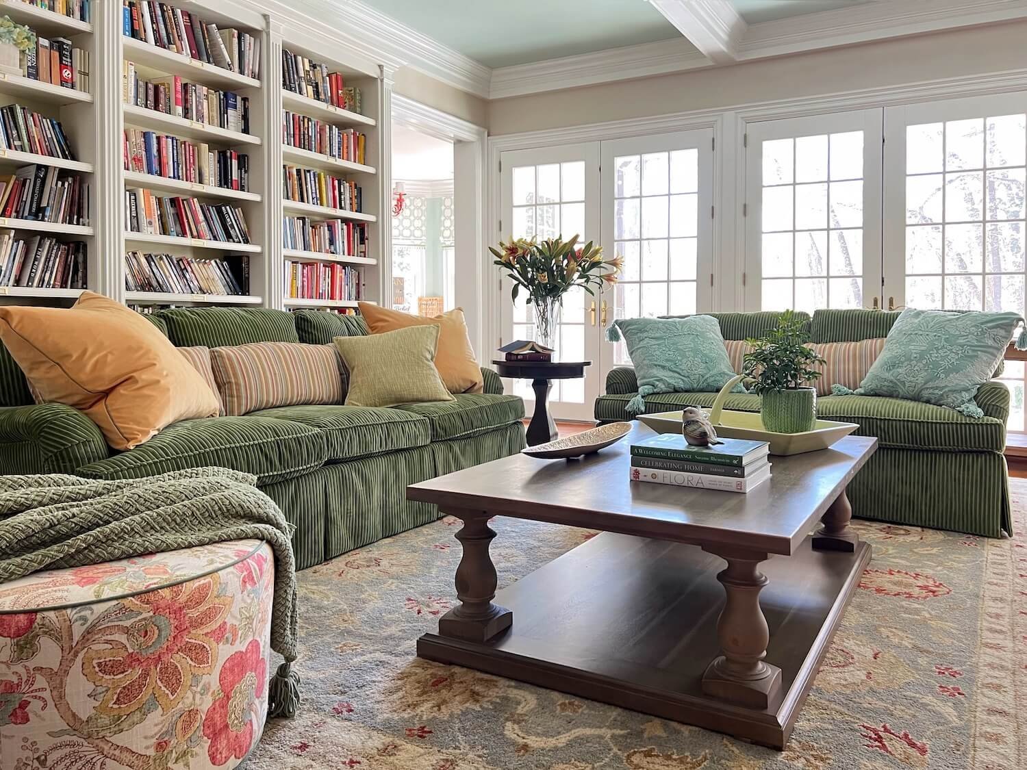
family room with cozy green sofas, soft green walls, brown stained wood tables, and crisp white built-ins and trim, JRL Interiors

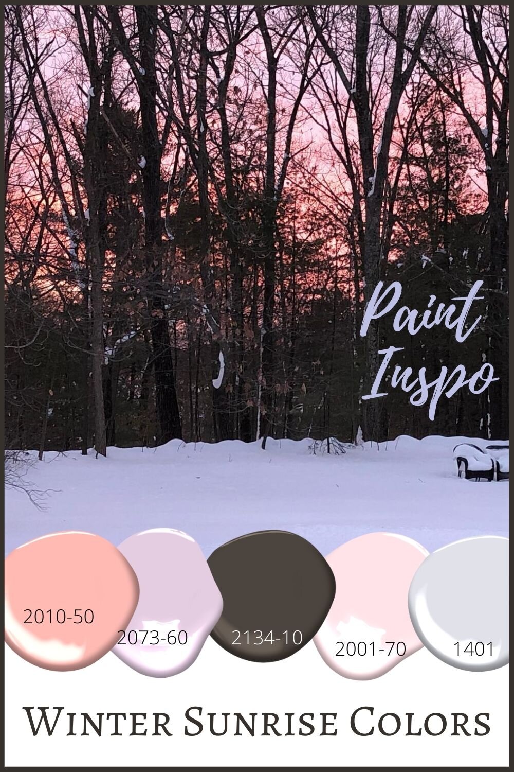
Winter Sunrise Colors
The pastels of a winter sunrise sparkle against a snow coated landscape. These happy colors are inspired by the sunrise picture below taken by my friend Bernadette.
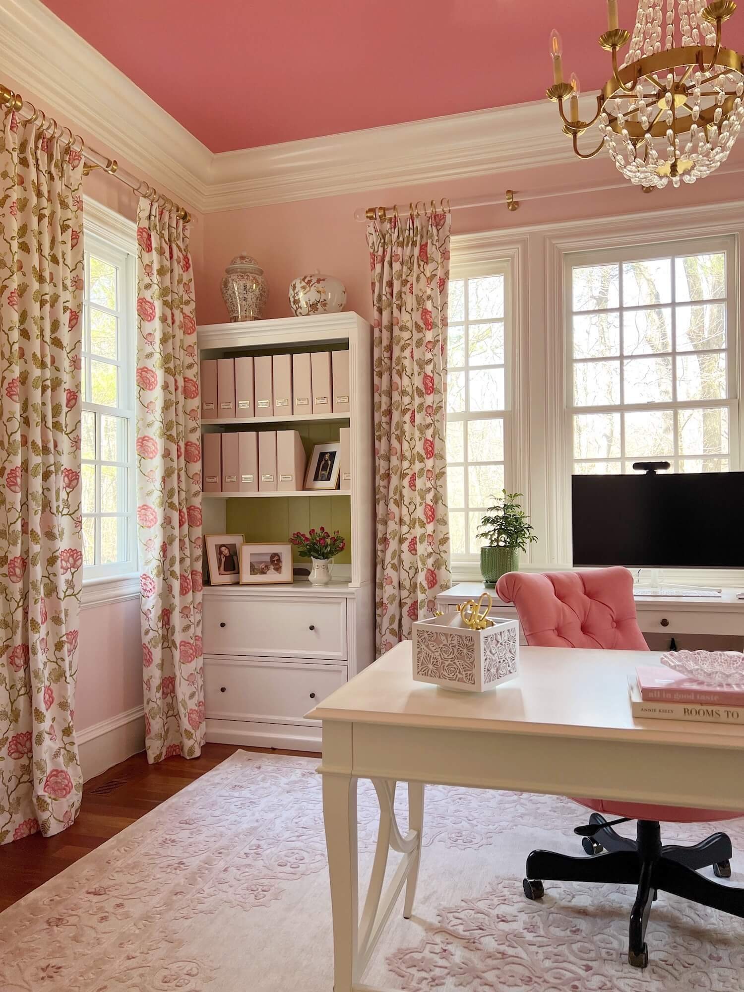
shades of pink from pale raspberry to deep fuchsia make this glam hoe office a standout, JRL Interiors
These shades from peachy pink to lavender would make for a peaceful, cheerful space. A touch of brown offers a beautiful counterpoint to keep a pastel room from being too syrupy sweet.
Winter Neutral Colors
Natures winter neutrals are anything but boring.

A neutral pale taupe and white kitchen, with stained wood island, JRL Interiors
Complex shades of warm pale oak to deep taupe are inspired by these deer in the winter woods.
With neutral colors, it is especially important to pay attention to texture layering a variety from wicker and sisal to velvet and chenille to create subtle sophistication. And of course, just like these deer, every room is improved by a touch of black!

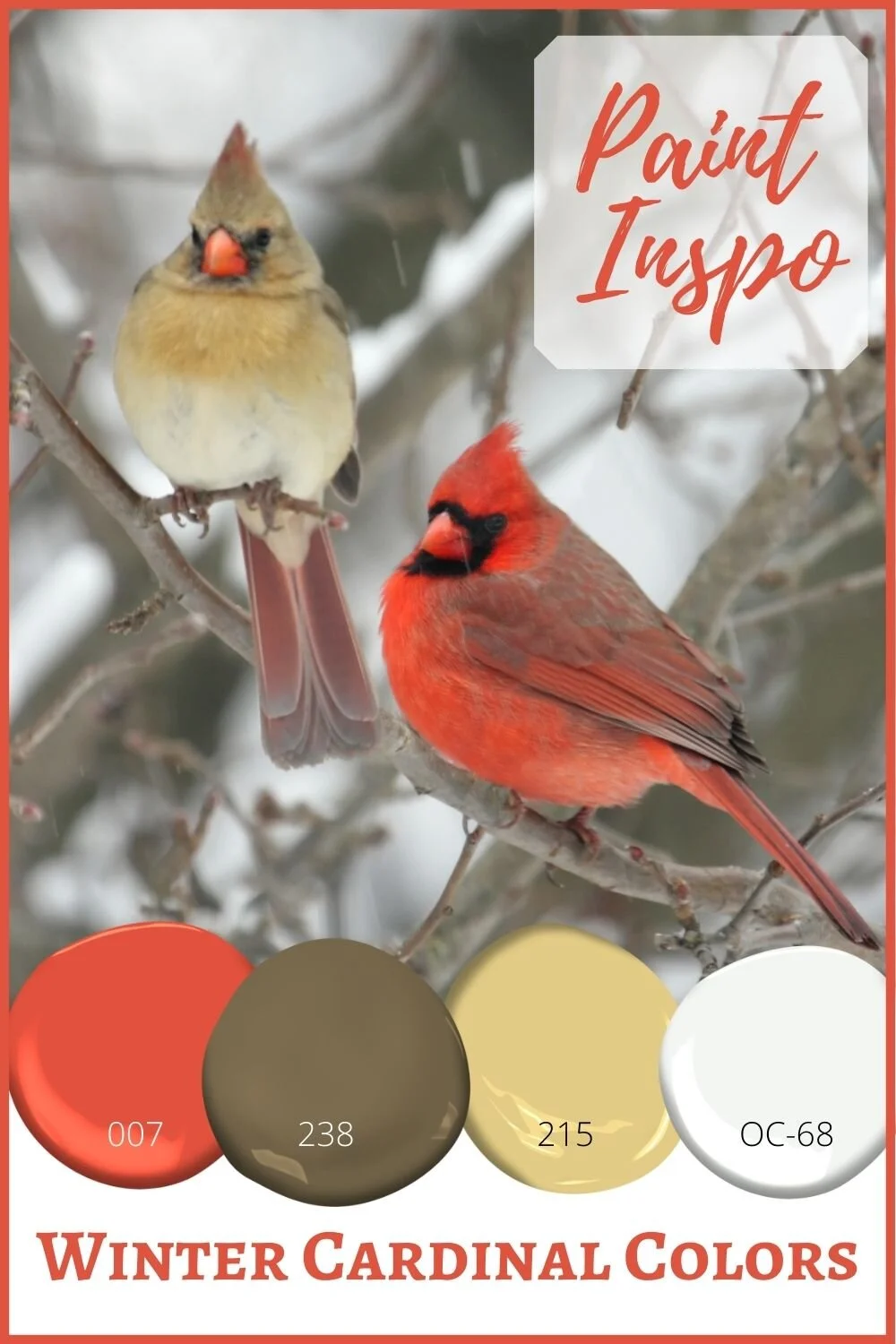
Winter Cardinal Colors
Of all the winter birds, cardinals are perhaps the most striking against the winter landscape.

And while Mrs. Cardinal in this pair looks completely nonplussed about whatever Mr. Cardinal has been mansplaining, they nevertheless inspire a palette of warm reds and mustard yellows against a tree bark taupe backdrop.
Winter Sky Colors
And finally, I would be remiss to not include a palette with a brilliant blue winter sky. The crisp cold air and angle of the sun this time of year produces the most remarkable shade of blue on a clear day.
This new build project features a palette of crisp blue and white (more pictures from this project here).


Blue and white is THE most classic color combination.

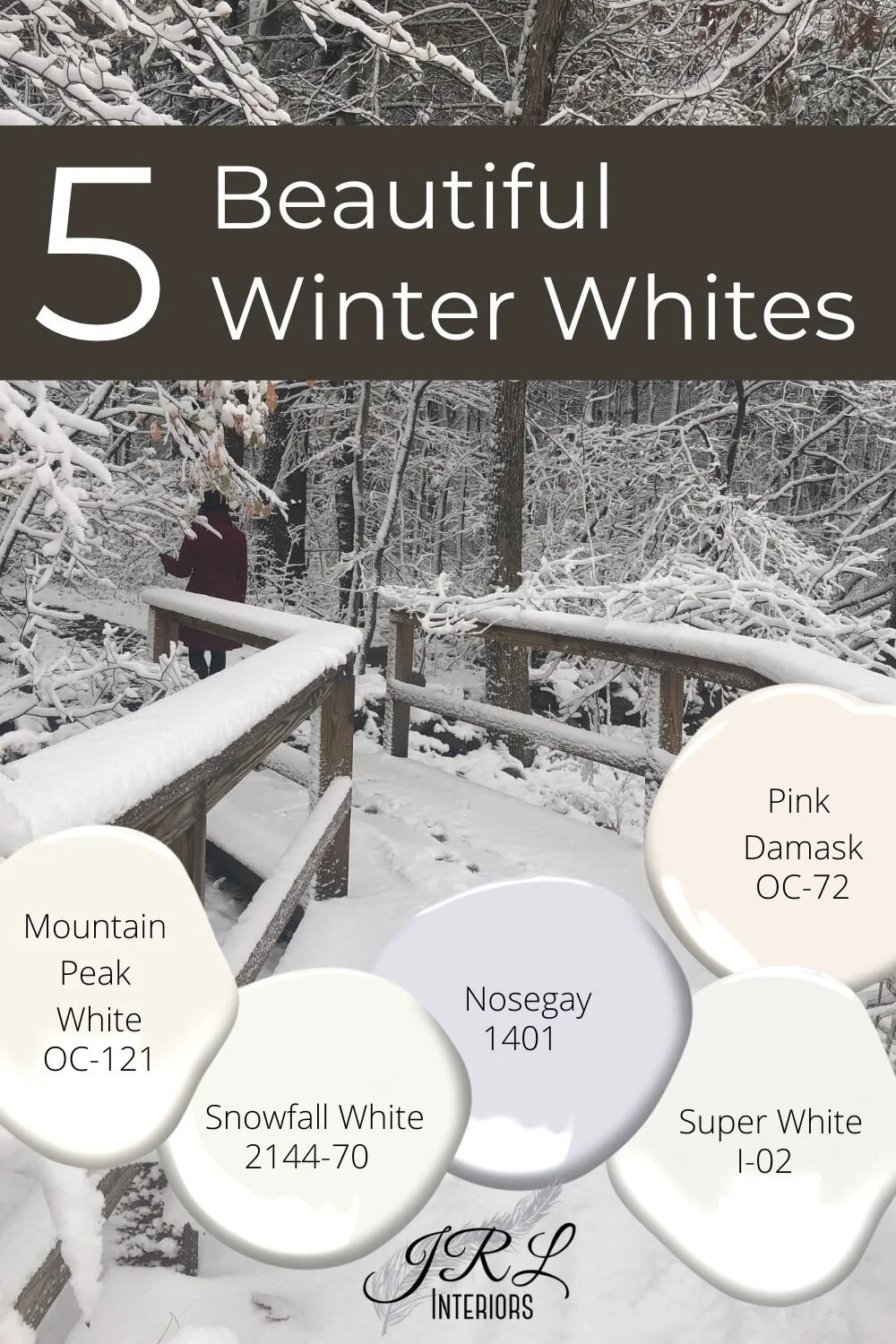
Winter Whites
Winter whites come in literally hundreds of variations. Most whites are not actually really white. They contain a variety of pigments that tint them in the direction of another hue - yellow, green, lavender, gray or peachy-pink.
These 5 exhibit a range of colors and can act as a whisper of color in a room when paired with a whiter white, or as a white when paired with a deeper color.
What colors are YOU embracing this winter?
Dreaming of spring? Check out some of our favorite nature inspired spring colors in this post., and our fall favorites here!
