And so it begins…the color of the year announcements for 2026 have started rolling in.
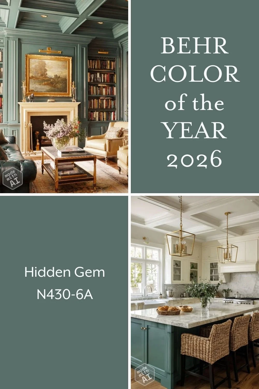
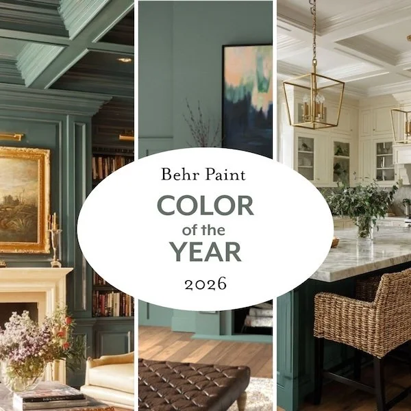
Behr paint is the first to announce and just released their color of the year, Hidden Gem.
I heartily approve. Of the color, that is. The name…less so…hidden where? why? what kind of gem? It doesn’t make a lot of sense to me as a color name, but then paint color names are notoriously questionable. I mused on some of the weirdest paint color names HERE.

This color reflects the prediction from WGSN (Worth Global Style Network), a prominent trend forecasting and analysis company that chose Transformative Teal from the Coloro color system as the color of the year for 2026.
I hope this means we’ll be seeing a lot of this color family in all sorts of the products marketed - from home interiors to fashion.
I love almost anything in the blue-green category and Hidden Gem is a smoky mid to dark tone teal-green. It is a classic and complex hue with many parallels in nature from ocean waters to blue spruce forests.
By complex, I mean it has a lot of different tints in it giving it a richer depth and less startling vibrance than purer hues. Complex colors tend to be easier to live with and so I generally prefer them when using large amounts.
I reserve the more saturated intense hues for accents…bookcase backs, furnishings, etc.
Behr describes Hidden Gem as a “hue that exudes quiet confidence…gentle and captivating. A smoky jade with an air of mystery and sophistication, this rich, dynamic color creates spaces that feel both grounded and alive.” Whatever. I love it regardless of the marketing drivel :)
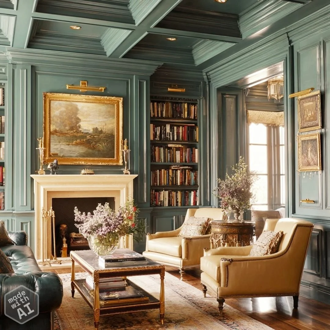
Here are a few images of rooms from the Behr website announcement


I’ve used similar colors in projects before -
The tile and wallpaper pattern in this farmhouse guest bath for example are a slightly more vibrant version.
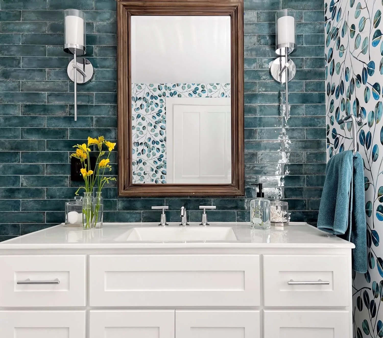
Farmhouse guest bath with teal tile; design - JRL Interiors
Or the bookcase backs in this family room transformation which are painted in Benjamin Moore dragonfly, a similar but more intense shade.

Family Room Transformation with teal accented bookcases, design by JRL Interiors
This is a moody color that lends itself to color-drenching…the relatively new trend of using a single color to paint the walls, trim, and ceiling. Here I’ve created an imaginary room using AI to show a color drenched library using this hue.
And here I’ve created an imaginary AI version of a neutral kitchen with an island in this accent color.

I find refuge in the beauty of nature to be particularly helpful in these turbulent times, and these soothing blue-green nature colors are among my personal favorites.
Knowing what the trends are can be helpful for knowing what is going to be available, but blindly following them without thought is never the right answer.
As I always recommend, find the colors that YOU are passionate about and that work in YOUR spaces to add joy and beauty to your life.