
What’s all the fuss about? Pantones Color of the Year for 2026
Pantone just announced their much anticipated Color of the Year for 2026 and the internet is in an uproar. Why? Because they chose white. Well, technically it is Cloud Dancer, which they describe as
a lofty white, “a whisper of tranquility and peace in a noisy world”.
In addition to inspiring relaxation they also claim it as a blank canvas on which to write a new start. And then they tie the two together claiming the calming nature of this color allows inner reflection that leads to creativity for fresh ideas.
Chat GPT has been working overtime…

Pantone is a universal color system rather than a product (like paint). And the color they choose usually reflects a direction for marketing, packaging, and product design in the coming year. So Cloud Dancer it is. Yawn.
It’s white, We’ve done white for what seems like forever…we’ve moved on. We are embracing color and personalization now, at least in interiors.
But white IS a classic, so it certainly hasn’t disappeared from design.
Although, the all white room is pretty much out of vogue since it is hard to feel comfortable or welcome in a room where you spoil the design just by being there.
Not to mention the potential horror of adding unwelcome dirt or stains. All-white rooms somehow always feel like they should be cordoned off with velvet ropes - pretty enough to look at, but not meant to be used?!
White, in its slightly warmer incarnations, makes a reasonable backdrop for other colors though, especially when used on millwork and trim and with a sheen that highlights the profiles.
And it will forever be a classic exterior color for cottages and mansions alike.
At the end of the day, much like a few of the paint color COTY selections, I am underwhelmed at the Pantone choice.
While I agree we could use some tranquility in the constant chaos that is this world, and a fresh start is oh so appealing, I am of the opinion that the color of the year should be a COLOR. And technically, white is the absence of color (in pigment, at least).
I suppose since in light, white is the presence of all color, there is some philosophical argument for it, but that’s all the concession I’m willing to make and I don’t think it applies to a company {like Pantone} with a universal color chip deck!
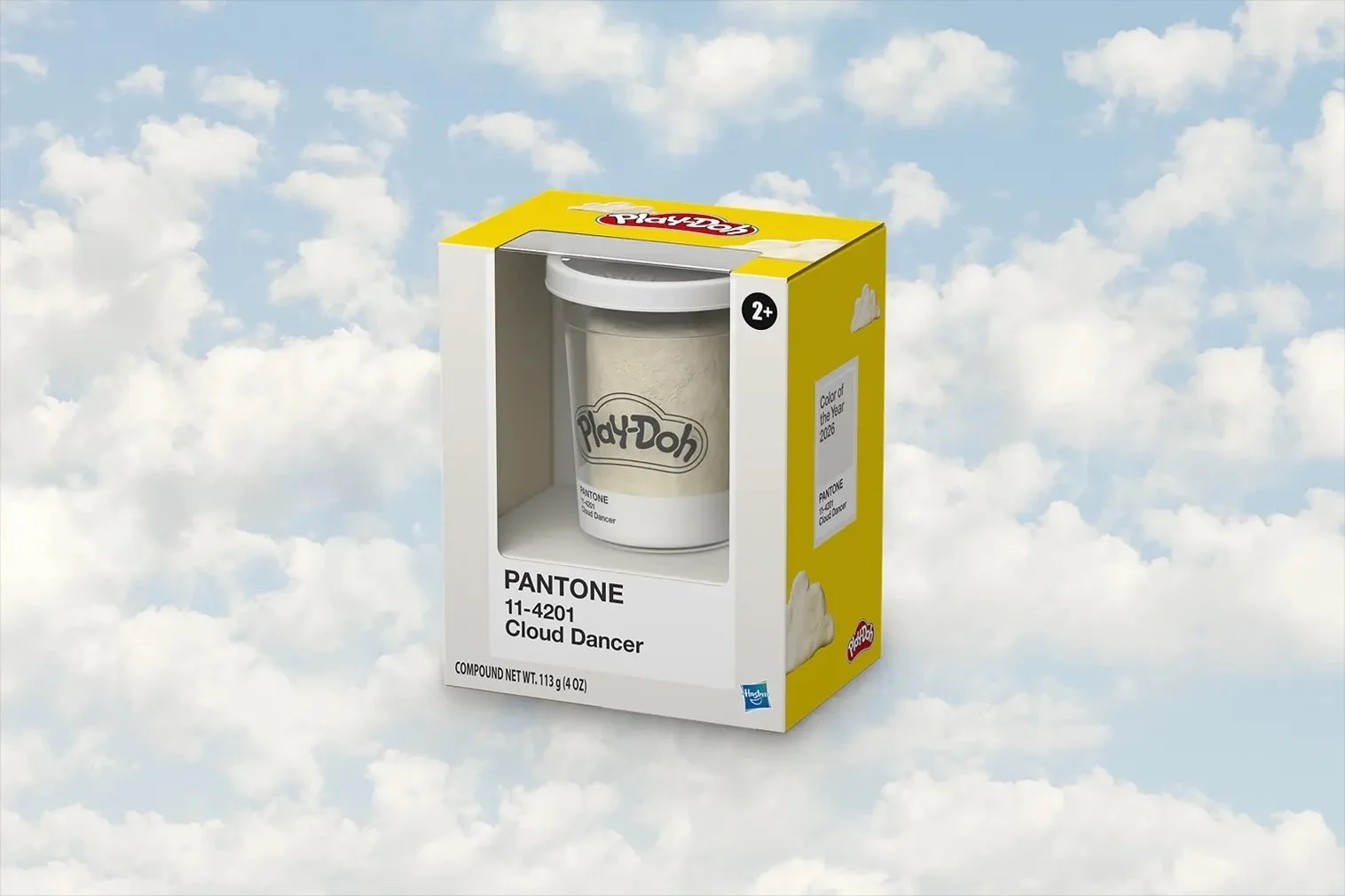
A few years ago, in a burst of marketing genius, Pantone started partnering with various products to produce promotional items in the color of the year. This year those products include furniture, a phone, and…Play-Doh, which is, I guess. the ultimate expression of tranquility-meets-creativity.
The previous four years have been more or less colorful - and at least they didn’t choose TWO colors - which they have done in the past and which is totally cheating.

I’m holding out hope for the 2027 Color of the Year to be something more interesting!
Other posts you might enjoy:
Benjamin Moore Color of the Year 2026