Well, the long awaited Benjamin Moore Color of the Year for 2026 was just announced and it is…
Almost exactly the same as the Sherwin Williams color of the year from 2021, Urbane Bronze. Hmmmm. I knew it looked eerily familiar.
I love a good dramatic neutral and I applaud this color in general…edging into warmer color neutrals that have been trending for quite some time now since we painted the entire world gray for a decade or two.
But again, it’s mostly something I’d consider a neutral-ish color, as opposed to a statement color. Which is disappointing as a color trend announcement.
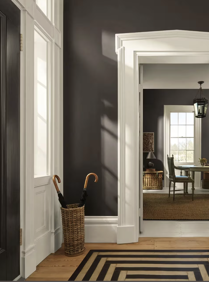
Foyer painted Silhouette AF-655, image via Benjamin Moore
And the name, Silhouette, while sort of chic, is by definition the absence of detail. It doesn’t exactly inspire any sort of emotional connection the way a name like ‘mochaccino’ might. But maybe that’s just me. I’m all about colors with food names - except maybe the ill-advised Farrow and Ball ones like Broccoli Brown and Dead Salmon. Really. If you haven’t seen my list of some of the worst paint names, you can see it HERE
It is a charcoal-brown with slightly more plum notes than the Sherwin Williams equivalent.
And, as always, how it looks in a room will depend entirely on the situation - lighting and surrounding elements will skew the perception of color.
Benjamin Moore suggests pairings with some of my favorite other neutrals like Swiss Coffee, Pashmina, and Paris Rain.
But as an earthy, woodsy, basically dirt color, it could be equally at home paired with garden colors like pinks and salmons, lavenders and blues, and virtually any shade of green. In other words, it is functionally a neutral.
Apparently inspired by emerging tailored fashion colors and the stability of a warm neutral to have longevity {because it plays well with others}, Benjamin Moore claims it chose this color for its refined elegance.
A whole room color drenched in this shade would be oppressive without some relief, but as a wall color it would make a dramatic backdrop that engenders a cozy, intimate feeling.
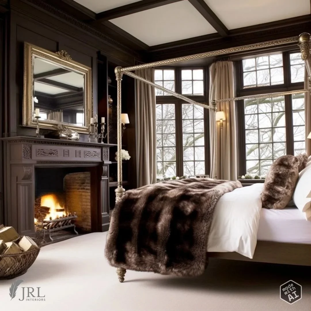
This AI generated bedroom drenched in a similar shade is relieved by a light rug and bed coverings.
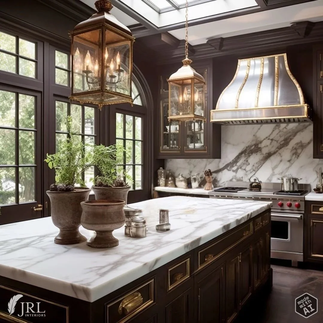
And, while I’d probably prefer a rich stained wood to paint, this color might be a stand in for that in a bistro style kitchen with rich brown cabinets paired with light marble like this imagined AI kitchen…though you can hardly go wrong if you start with some spectacular architecture…
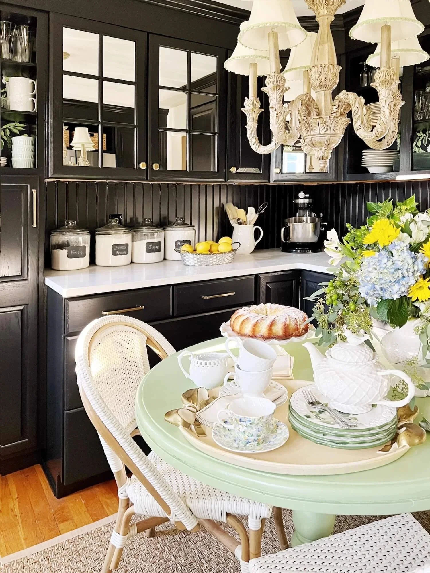
For painted dark cabinetry (rather than stained wood), I almost always prefer black to shades of brown. Black is enduringly chic in almost any architectural environment as evidenced in the transformation of my own very dated kitchen (before and after kitchen HERE and HERE) with black paint.
Kitchen makeover with black paint, JRL Interiors
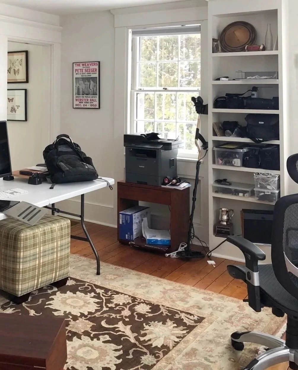
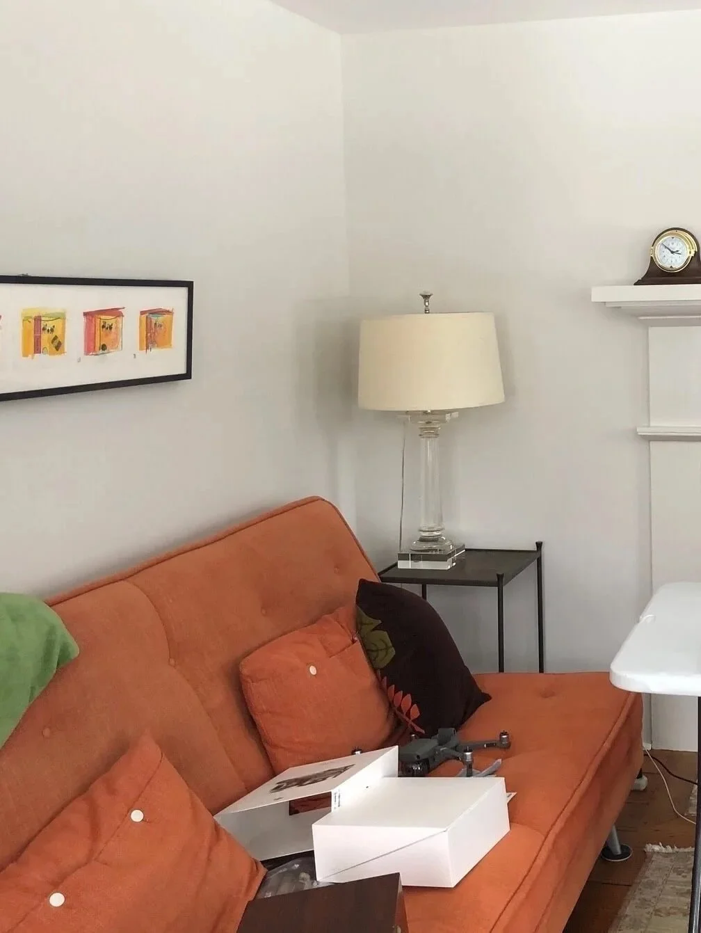
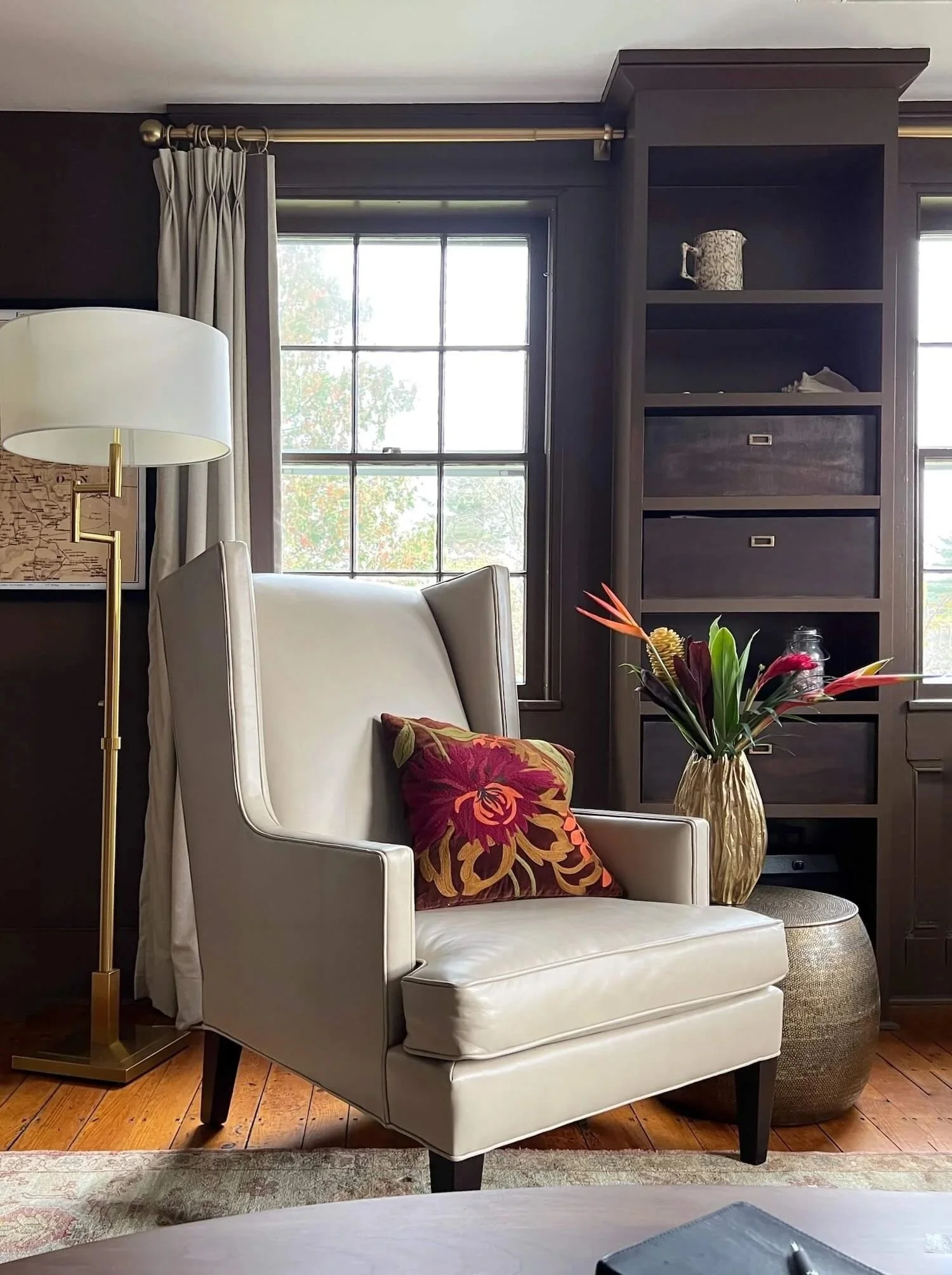
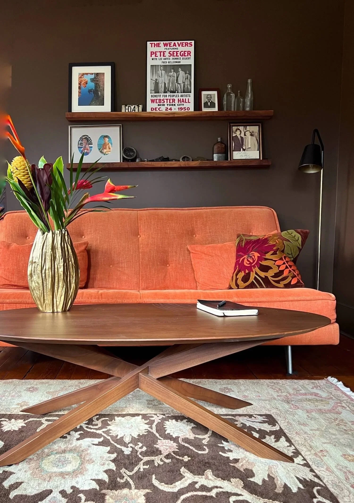
We used a similar shade to paint the walls and millwork in this home office in our farmhouse project, drawing the color out of the rug and transforming the space from bland and uninviting to sophisticated and warm.
There are many ways a dark neutral like this is a useful tool:
A gallery wall of art hung on this color could be striking.
A television hung on this color wall would blend in, neutralizing the back hole phenomenon so often seen with big black screens dominating a wall.
It could make an interesting exterior house color as well and one that nestles nicely into natural surroundings.
Textiles in this color could be rich additions to a room - think of a mohair sofa in this rich earthy color, or velvet drapery panels paired with a patterned wallcovering.
There are, of course, a variety of other warmer/lighter shades of brown in the Benjamin Moore lexicon - you can see some of our favorite browns HERE. So there is always an option to work in your space if you like the idea of adding drama and warmth in this way.


