I am categorically against most things defined as “trends” if by trends we are talking about fads popularized in service of creating FOMO for a profit.
We’ve seen a parade of styles with names like grandmillennial, cottagecore, barbiecore, and more recently cluttercore (insert eyeroll here).
For the last dozen or so years we’ve seen everyone rushing out to paint their rooms white or gray, drowning us in shiplap covered everything, and tripping over themselves to incorporate the “farmhouse” look into the most unlikely and decidedly un-farmhouse spaces.
I am not against gray (though I’m a bit weary of it after such an assault of it over the last couple of decades), nor am I against white. And I think appropriately designed actual farmhouses are gorgeous - we’ve worked on several and they’ve been spectacular.
What I AM against is mindlessly stocking up on the latest ‘it’ trend at whatever your favorite shopping haunt is and plastering it all over your house in an effort to keep up with whatever Instagram is currently spewing.
Fads speak to a manufactured frenzy to fit in with the latest thing, trends speak to a design drift in a certain direction that may or may not stick around to become a classic. But here’s why paying attention to trends might be important…
Trends determine what will be available at the mass-produced retail level for things like furnishings, plumbing fixtures, cabinet finishes, and textile colors and textures.
Design, by its very nature, should be intentional and personal. It should bring out the best in the space and the best in the people who live in it. It should make life easier and more comfortable and welcoming.
If trends work in service of those design goals, I am all for them!
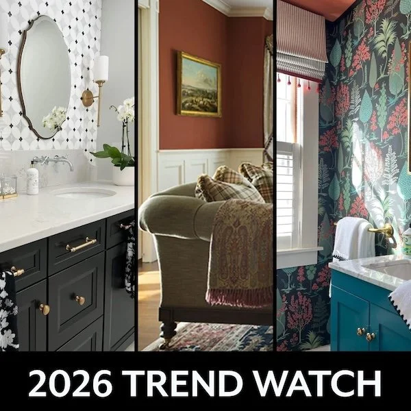
The trends I see moving forward into 2026 are ones I’ve seen coming into the forefront for the last 3 or 4 years at trade shows and furniture markets.
Color Trends
If I’m pressed to define what colors are trending for the the coming years, I’d say we are leaning into warmer colors with beiges and creamier whites replacing the cooler grays and crisp white tones of the recent years.
Warm colors tend to produce a more cozy and comforting atmosphere. The sitting room below is from a project over a decade old, but the classic style and warm colors are equally relevant today.
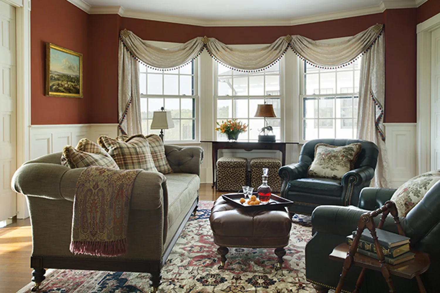
Cozy Sitting Room on a Gentlemen's Farm by JRL Interiors
Color of the Year announcements from Sherwin Williams and Benjamin Moore bear this out.
Below is a lakehouse dining room that was refreshed with warm toned wallpaper and paint, gold toned accents, and blue and green furnishings and fabrics. More images of the lakehouse project HERE
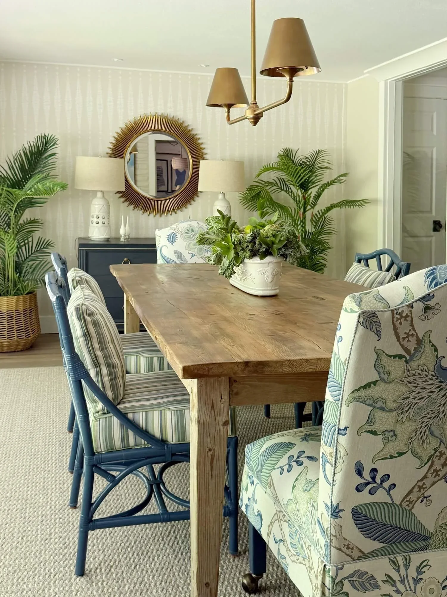
Sophisticated Lake House Dining Room by JRL Interiors
We’ve seen nature colors continuing to be strong as well with the Behr choice. Greens and blues reflect water and sky - also nurturing a peaceful feeling.
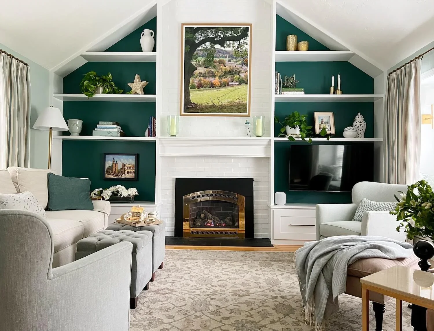
The family room refresh below (before and after pictures HERE) incorporated sea greens in varying intensities alongside creamy oatmeal colors.
Style Trends
Personal preference is king and anything goes is more or less the order of the day.
I also see much more melding of design styles with beautiful traditional classic antiques and vintage pieces joining new comfortable upholstery pieces to bring warmth and soul and personality to spaces.
Our church condo project pictured below incorporated the clients collection of heirlooms and art alongside new furnishings to create a uniquely personal and comfortable home.
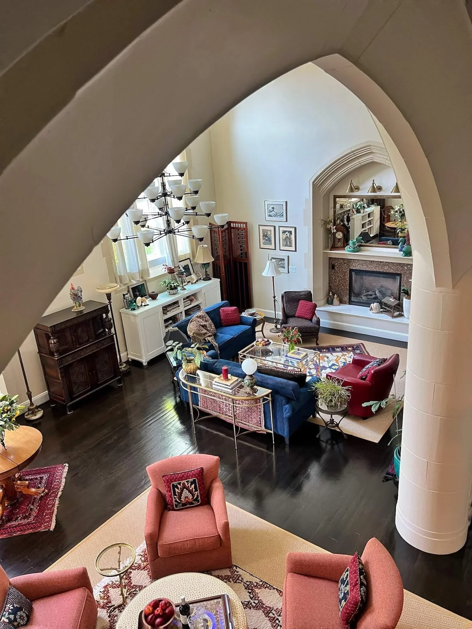
Church Condo Project great room by JRL Interiors
Original artwork and beautiful hand-crafted rugs are becoming more popular. I’ve installed many gallery walls to showcase collections my clients have.
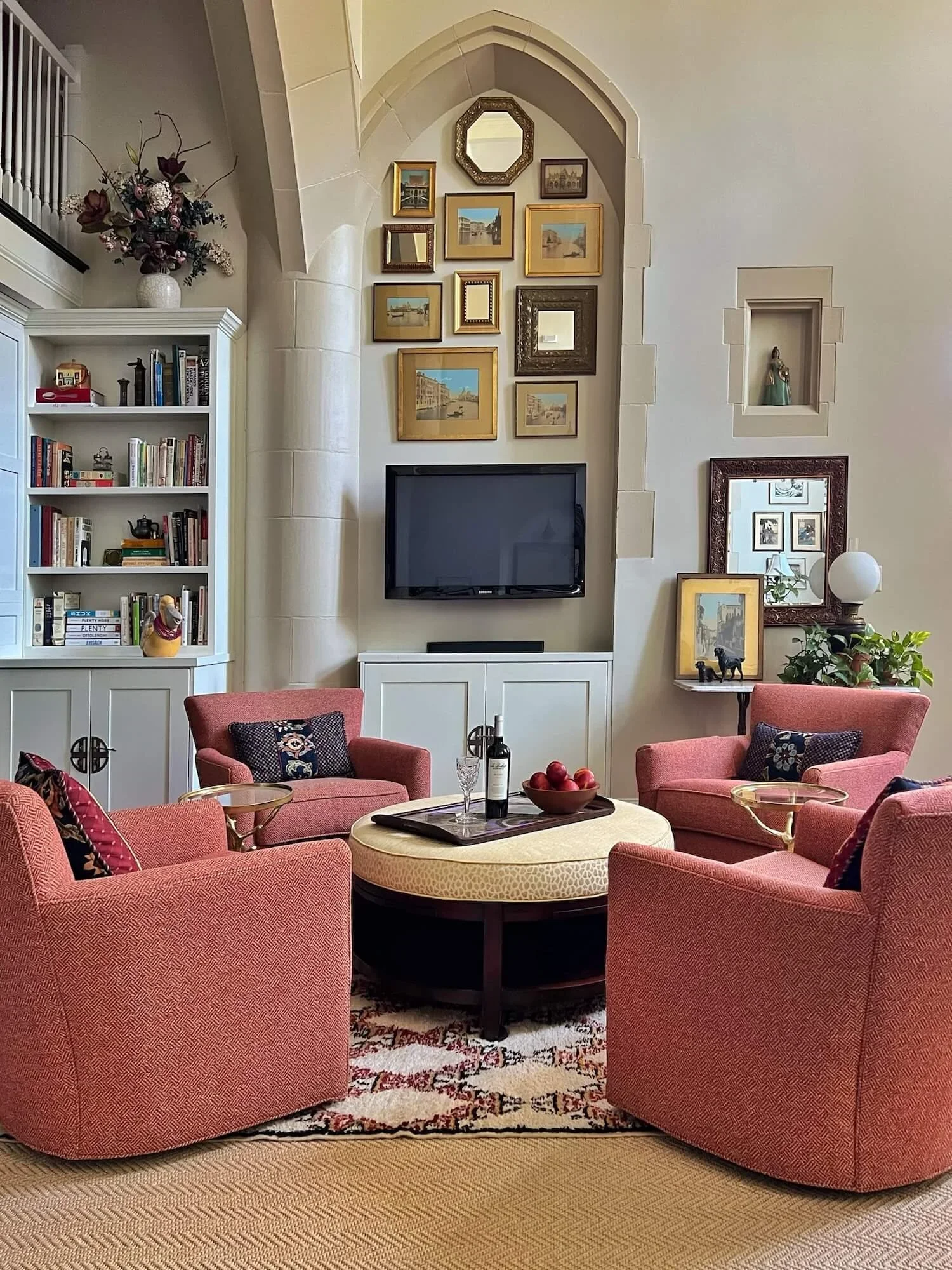
Gallery wall in a church condo project by JRL Interiors
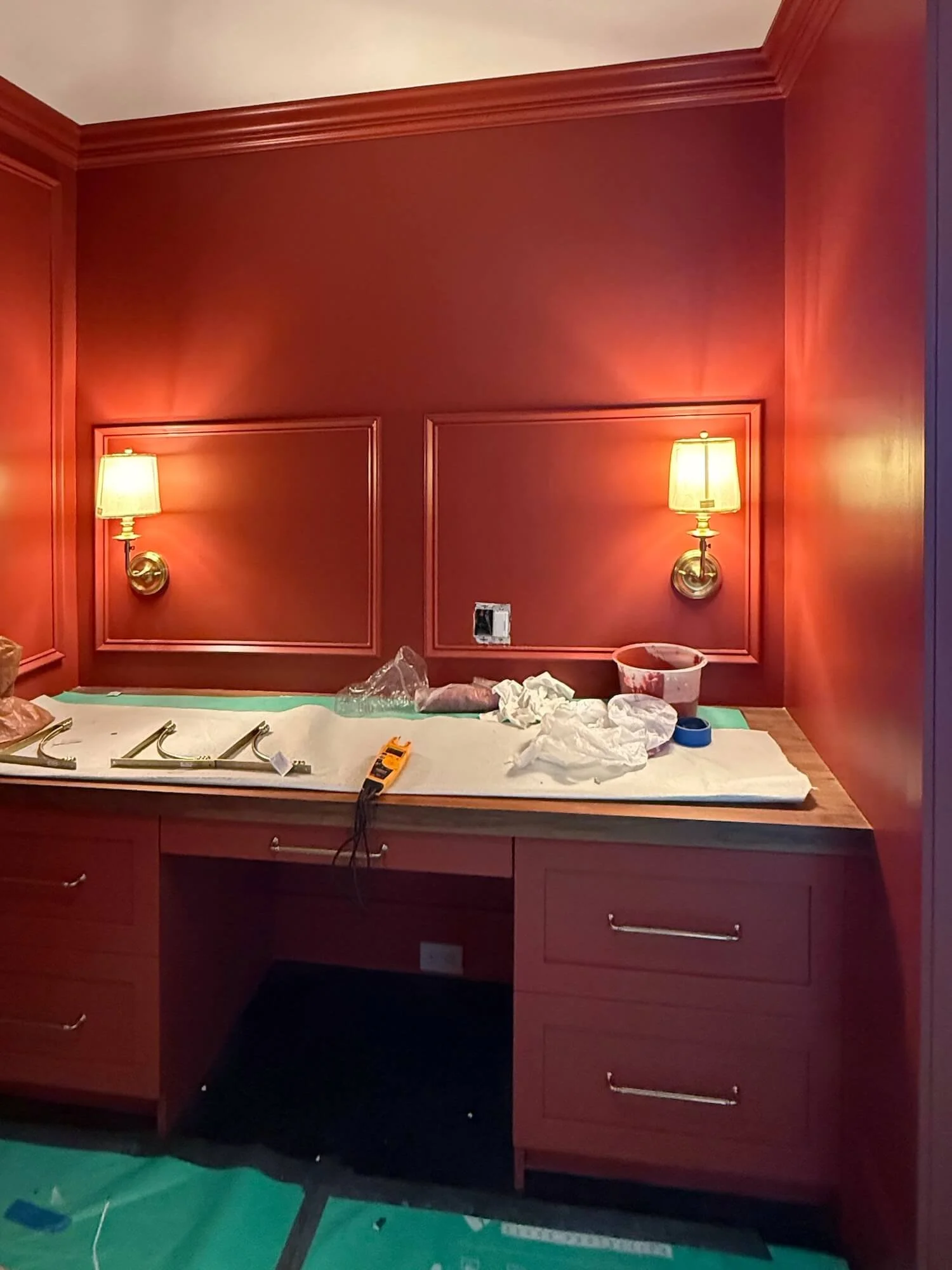
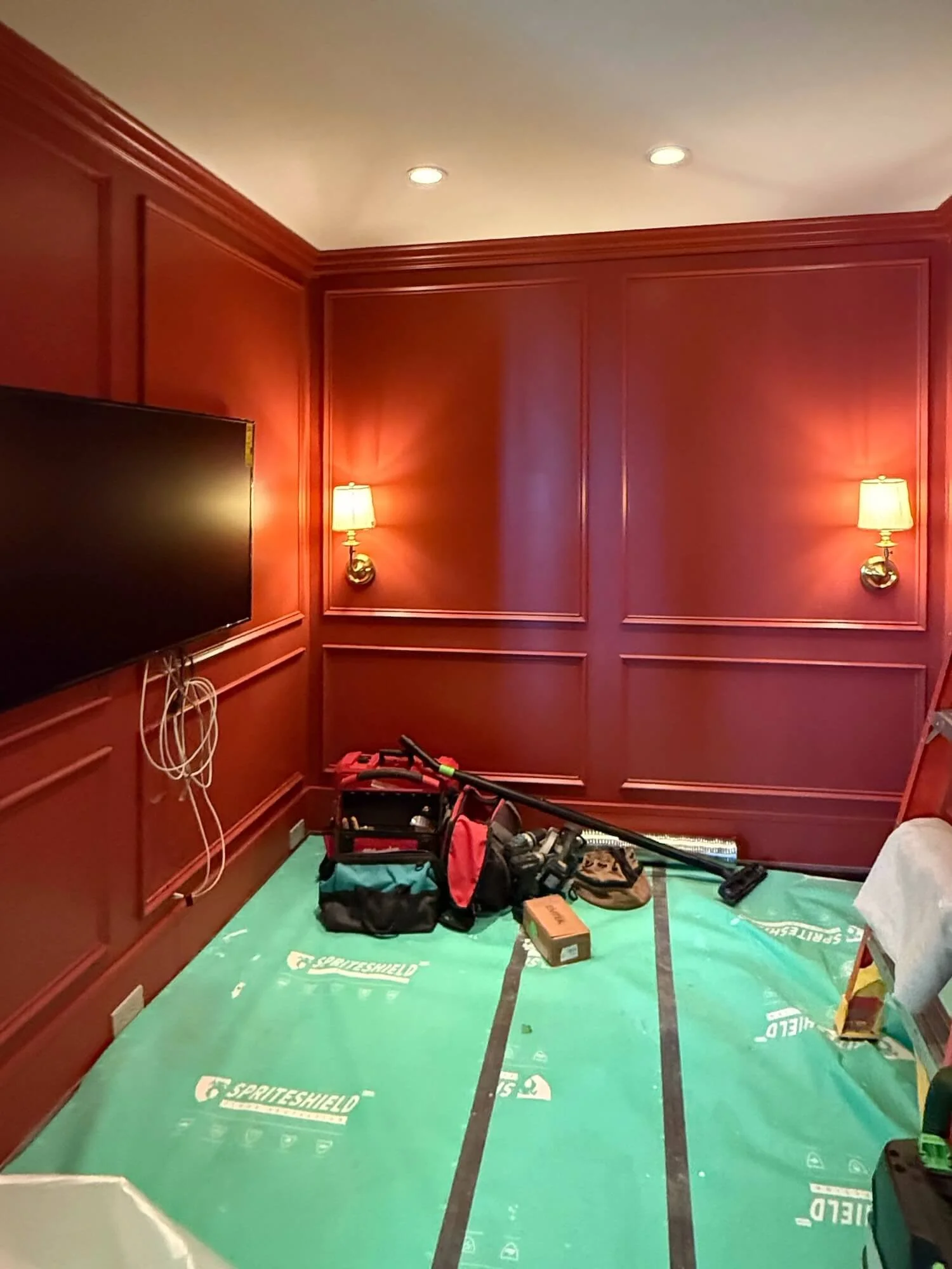
Color-drenched rooms where the millwork and walls and sometimes even the ceiling are all painted the same dramatic hue can be a wonderful way to create a cozy, nest-like feeling.
This project-in-progress uses a warm red to transform the mood of this windowless office/TV room.
Pattern and Texture
Pattern and texture is showing up in the resurgence of wall-covering as an effective design tool. Wallpaper is showing up in framed panels as well as on walls and/or ceilings in dining rooms, bedrooms, bathrooms, and powder rooms. There are wallpapers that mimic metallics, textured textiles, and bold patterns.
This elegant foyer project (before and after pictures HERE) used framed painted grasscloth panels and a wallpapered ceiling to transform this builder basic space into something spectacular.
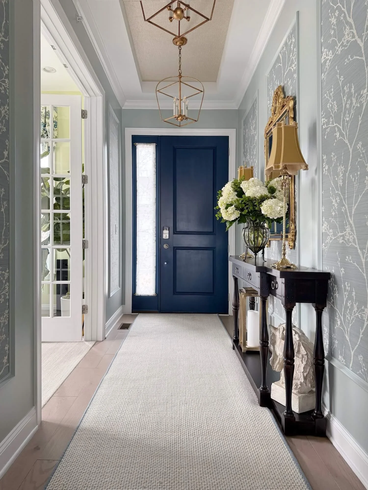
Elegant Foyer Transformation by JRL Interiors
Bathroom and Kitchen Trends
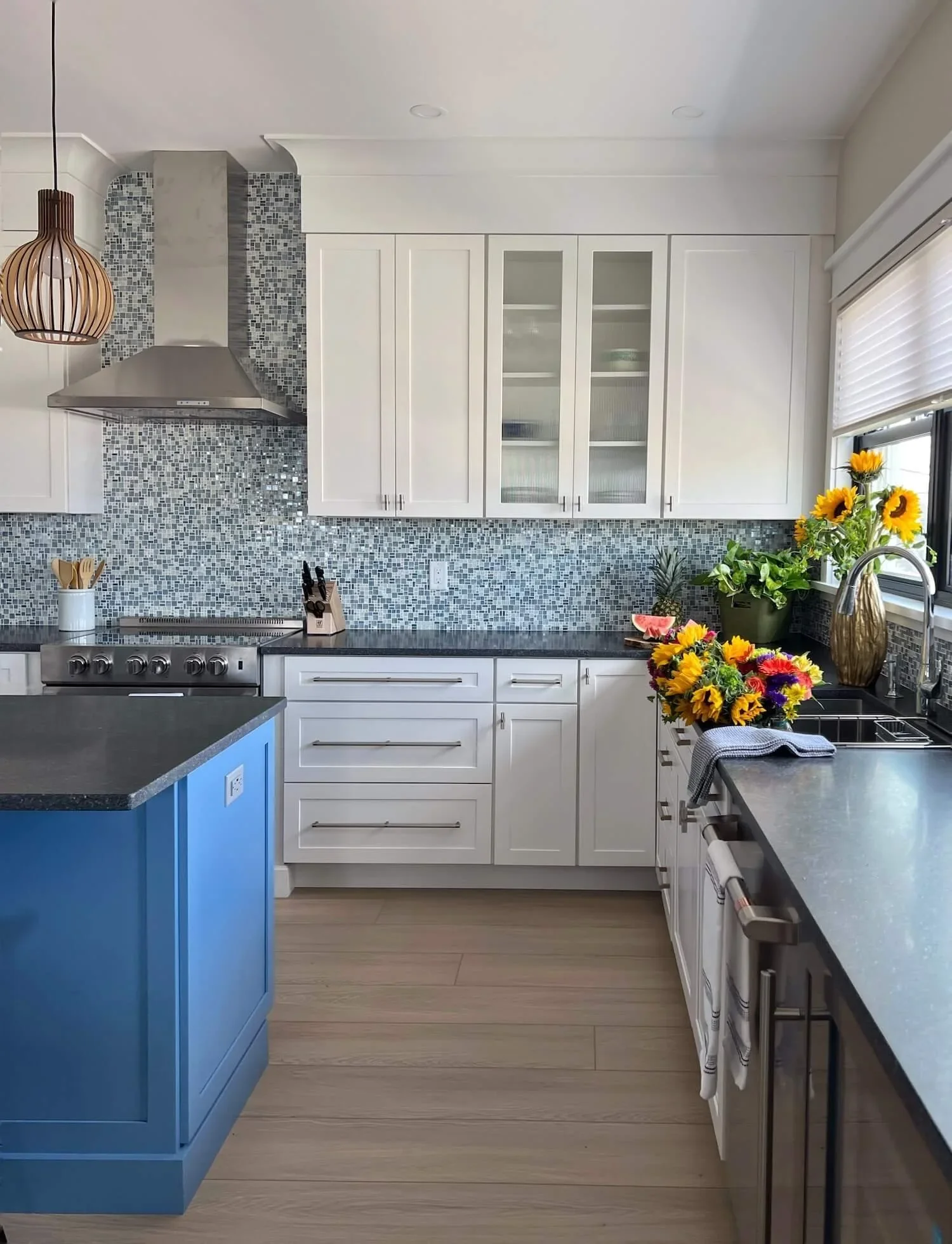
More and more colors have been popping up in kitchen and bath offerings. There are more fixture and tile color choices than ever. And pattern and color in either tile or wallpaper is trending in both spaces.
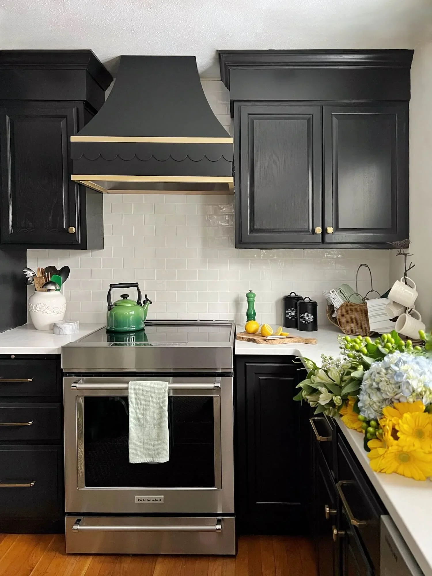
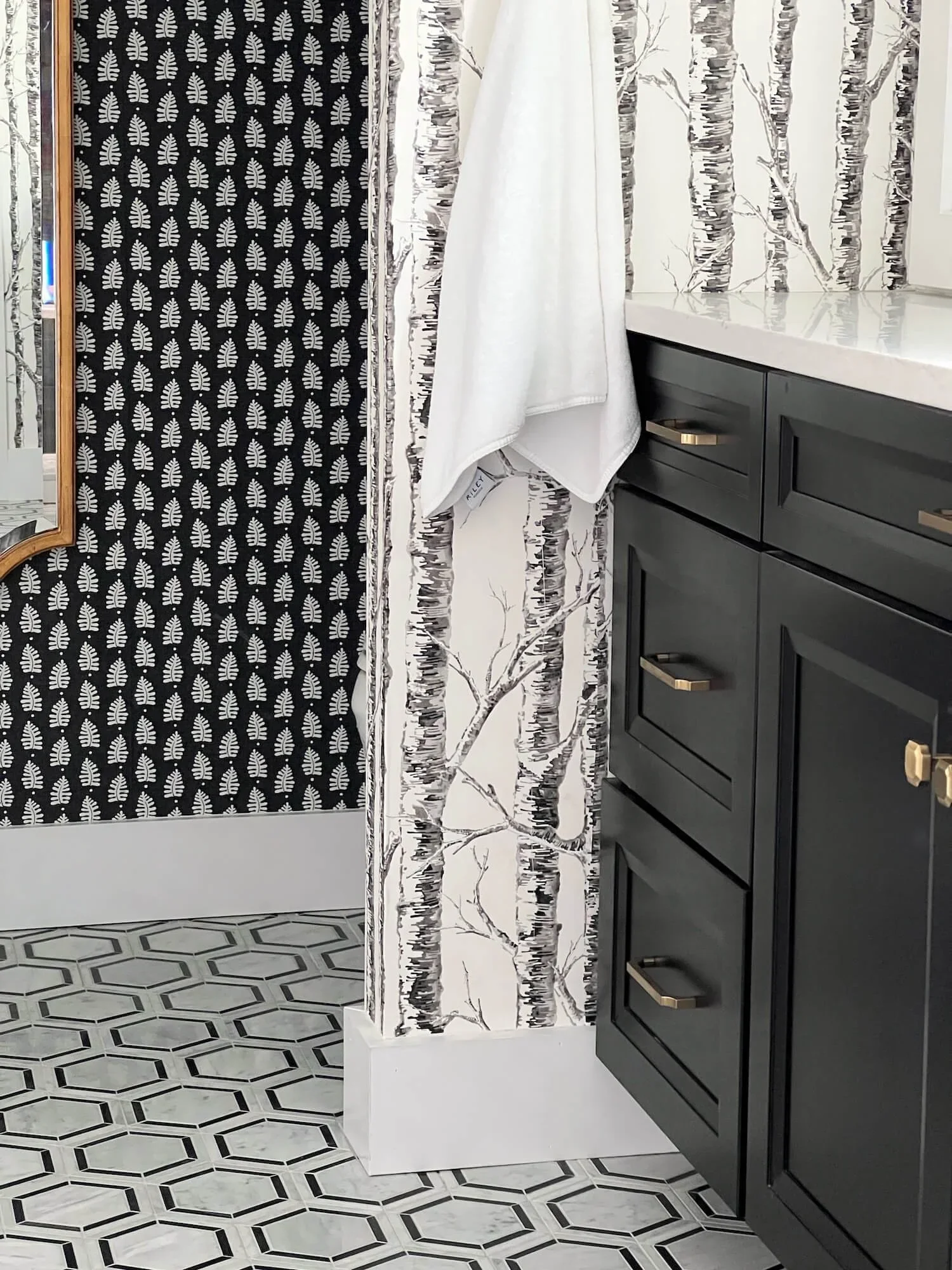
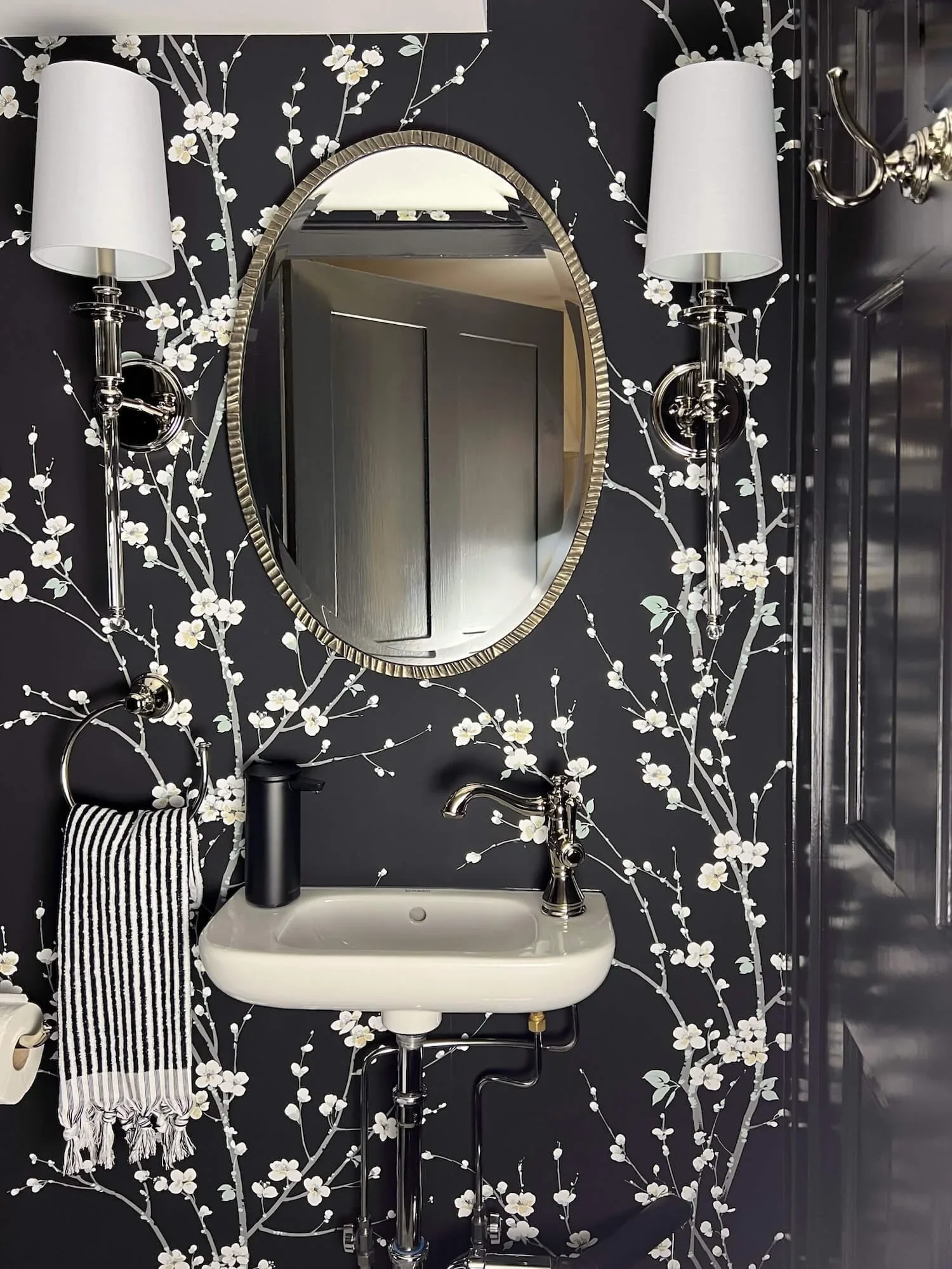
The pictures below illustrate a bold blue island in our beach house project, dramatic black cabinetry in my own kitchen refresh, a mix of wallpapers and tile patterns in an antique farmhouse primary bath renovation, and playful bold wallpaper in a beach house guest bathroom.
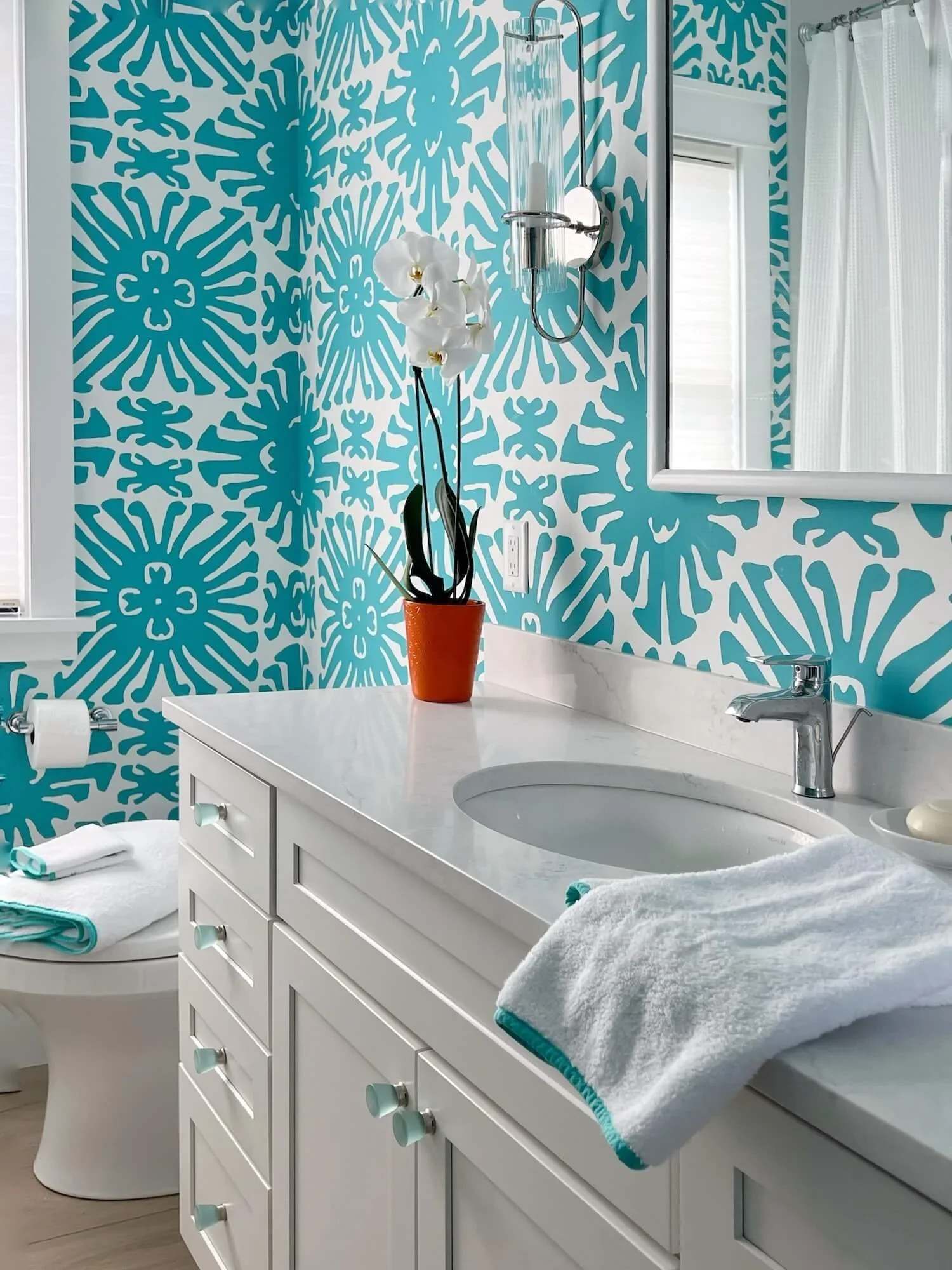
I LOVE using wallpaper (and color) to make dramatic impact in powder rooms. More images of the two dramatic powder rooms below can be found HERE and HERE.
Case goods like chests and buffets have been showing more cane panels and reeded or fluted detailing.
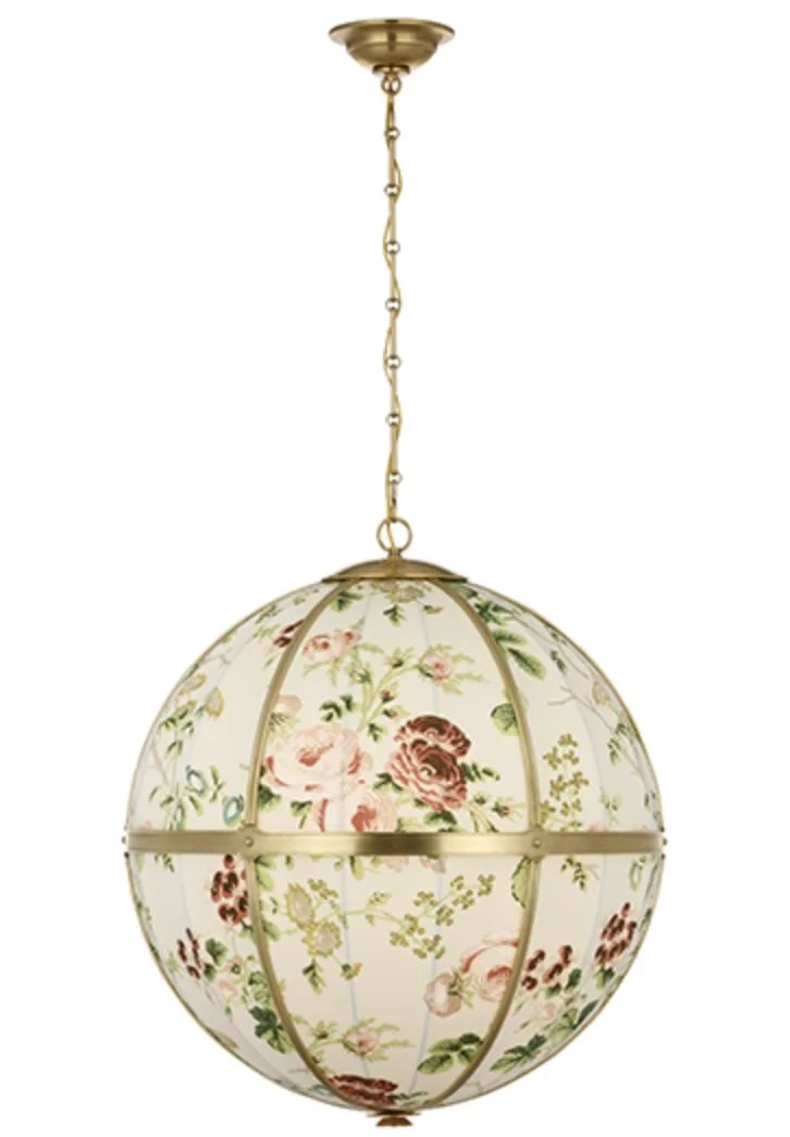
Even lighting is getting more innovative and decorative. Almost every lighting line offers something with texture like wicker or cane or rope shades. Schumacher has partnered with Visual Comfort to create light fixtures with designer fabric shades like the one pictured below.
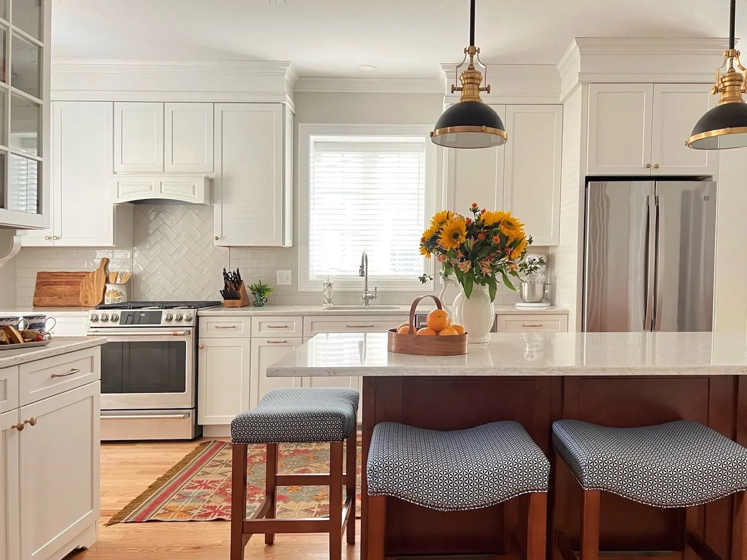
After years of all white cabinetry being the default, there is a resurgence in stained woods from medium cherry tones to lighter rift cut white oak being incorporated into the design, as well as paint colors from black to blue or green being added to the mix.
This white and taupe kitchen is part of a great room and so we incorporated the tones of the clients traditional furniture pieces into the wood of the island.
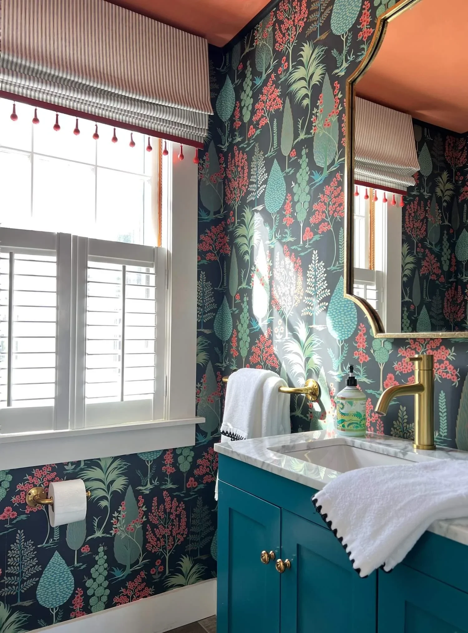
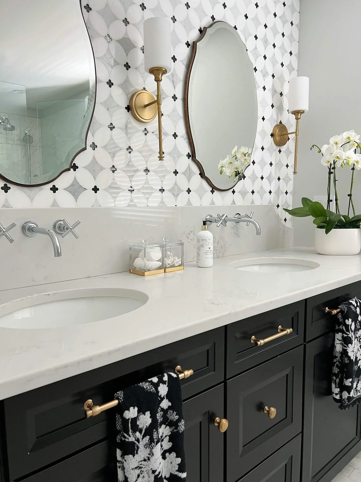
Carefully mixing metal finishes is also trending and adds a sophisticated polish to rooms. Warmer toned gold finishes are increasingly popular for hardware, lighting. and even powder room faucets.
This guest suite in an antique farmhouse uses a mix of polished chrome and satin gold metal finishes, and a beautiful mosaic marble accent wall to add pattern to this classic neutral bath.
Personalized design is perhaps the overriding trend and one I am happy to see. The essence of design is personalization and pretty much “any style you like” is what’s in right now.
I have always maintained that any style can be spectacular as long as it is curated thoughtfully.
“You do you” has never looked so good!